Icon optimization or how to increase conversions
You and I have finally come to another small but essential detail of ASO, icon optimization. We have already partially touched on this topic in the AI and visual optimization article. The icon is a detail that takes up less space than the short description, but this does not correlate with its importance. Take at least the fact that the icon is the only thing that will accompany the user throughout the entire interaction with the application. Everything starts with installation, then searching for the icon on the phone screen and constantly launching it by clicking on it. At this point, everyone has realized how important the icon is, but we are looking at a more detailed issue here.
Icon and its importance for ASO optimization
We discovered that a full description promotes your app's ranking in search; a short description helps it do that and is more likely to be read instead of extensive text written by your copywriter; screenshots and videos help make a final decision. So what does our icon do? The icon is Captain America in the world of ASO, leading the way for everyone, don’t worry; it's about to become apparent. The icon comes into play when a user enters a keyword search query without looking for a specific application. Why is this small icon so important? It's simple, people more readily perceive and process images much faster than text. That is a win for icons, and the second win is that they are the first to draw attention to themselves, not the name. The title comes after that.
We will reveal a secret you didn't correctly remember. We choose apps based on icons. Our brain decides: how much we like it, whether it fits our criteria, relates to the application and its content, etc. Your choice will be made even before you go to the application page. The second part of double verification is the app page with all content.
Of course, let's not forget about our gray cardinal called text metadata. The keywords and phrases in it allowed your app to get where it ended up. Why are we telling you this? So that you don't get the thought: "Aha, so the icon is the sheriff, so let's put the main efforts on it." In case, I would like to know. After all, our purpose is to guide your thoughts in the right direction.
Let's get back to icons. So what can help us to draw attention to them, and what can encourage users to proceed to your app page? Let's take a look at:
- Minimalism. It's simple; minimalism is already one of the main trends in visual optimization. How quickly the brain will "respond" to the icon to simplify perception.
- One main object. Also, no secrets. It is easier to focus on one thing than on a detailed picture. Remember that this is an icon; to detail, it is a controversial idea as very little can be made out if you add a lot.
- Use the words only as necessary or if they are a central part of the icon. Words in the background make no sense because they will get lost against the background of the main object, and adding many words will not work. So either you make them the main object with the focus on them, or you can add them to the background if you need them, like in Erudite.
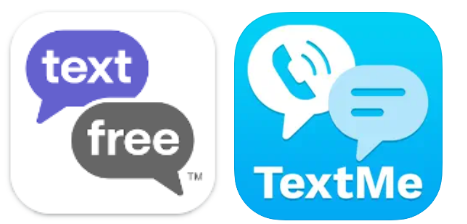
- You don't need to make an icon based on photos or screenshots. Photos most often have a lot of detail in them, and as we already know, a lot of detail on an icon doesn't look good and doesn't work as something that should draw attention. Screenshots won't work because they're designed to inform what the game or gameplay looks like, and the icon is too small for those purposes.
- Recognizable design. One of the most problematic things to recommend, yet functional. Problematic because it is hard to achieve and valuable because it will help you tremendously in the future.
P.S. Depending on the platform where you place your app, keep in mind the design features for each. For example, Google Play and Apple Store automatically round corners.
What can we learn from this? What do we need for a sound icon? We've highlighted a few main aspects to keep in mind when creating icons for Google Play and the App Store:
- Uniqueness. You must be different from the massive number of applications that will be your competitors.
- Recognizability. This is closely related to uniqueness, but it's a slightly different aspect—the aspect of being noticed because of your unique idea.
- Relevance. The icon should match the application, i.e., its content.
- The icon should look good at all scales.
Optimizing visual elements
We have figured out how to create and what to rely on during this process. Now we need to figure out how to optimize. On the one hand, you can create a new icon, and that's it because we already know how to do that. But what if the customer likes the concept of the icon or the application has already been launched, but the conversion rates have dropped, and you need to change the icon while keeping it recognizable to the old audience? It's not so simple anymore, but it's unambiguous. Sometimes there is an opportunity to start from scratch, sometimes, you need to optimize existing ones.
Let's look at the crucial points in optimization that can also be applied to creation.
Brand. The first thing you need to know and decide on. Is there a brand for what you are optimizing? Does it make sense to use it as an icon? A brand in an icon is good, it means you are already somewhat known and can afford a little less fuss, but only a little. Stylization and adaptations to the icon should be there to make it look good. It's also worth remembering that a brand isn't a panacea; it's probably a bad idea if you're not well-known.
Idea. Speaking of the idea. You need to decide what will be on the icon itself and what it will display: history, a feature of the application, or an intricate message. This will help you understand what direction to take. If there are problems with ideas, it is standard practice to analyze successful competitors. Adapting it for yourself is also an idea.
Style and color. To be honest, about this, you can write a separate article or instead read it. It's more about matching the application. It is extremely strange to make different color schemes for the application and icons and also applies to styles, although in their case, it is not so critical. Significant differences can give the user a slight feeling that something is wrong.
Because of all these criteria and suggestions, the number of icons, even with the same concept, can be very large, to say the least. There is a very easy way out of this situation, A/B testing. This type of testing will help you understand which option is best and most liked by the audience. Don't neglect testing icon prototypes, we don't always know what will shoot out.
As you can understand, the icon in the optimization is present, you cannot just skip or leave it without changes because it is what the user will interact with from the first moment of acquaintance with the application until its deletion.
Icon evolution as a way to promote your application
Icon evolution? What are you talking about? It's simple if you created your project long ago and are stuck with one icon, at some point, it becomes so old that optimizing it becomes its evolution.
In fact, not everyone likes to change their icon or logo. "After all, we are recognized because of it." Yes, but you can't stand still and be the same because you, your application, and its users are evolving. In this case, staying in one place is no longer an option, it will be a loss. By changing the logo, you, so to speak, refresh your brand and show people that you care about every aspect.
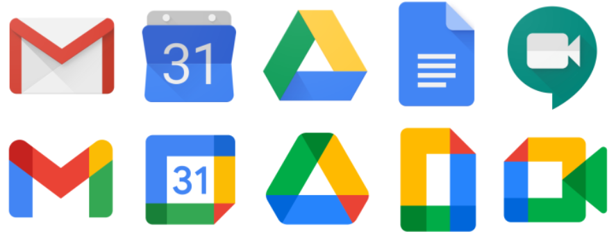
One prime example is Google Play itself, which was Play Market. At one point, Google started pulling its services together because they all looked very disjointed and not necessarily associated with the company. So, you won't believe it, Google picked one color palette, a similar style, and now each product has a unique icon or logo, but it still has a tie to that company.
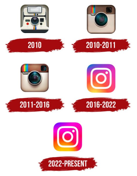
Let's take a look at the evolution of another internet giant Instagram. What do we have here?
Does everyone remember the first Polaroid icon and its subsequent changes? Instagram didn't seem to have some significant and numerous offshoots, but still, the icon decided to change. The first reason was banality, the rights to images of a stylized Polaroid. The second reason for the change was users. In the beginning, Instagram was just for posting photos, but after a while, the platform started to evolve into something more, and the evolution of the logo and icon followed. While photos were still essential to the app, the focus could sometimes shift to entirely different aspects. So the camera remained as something that could no longer be disconnected from the logo and added a vibrant color palette that began to reflect the community and its diversity. Speaking of which, the Instagram logo we all got used to in 2016 caused a furor and, as it turned out, jumped forward in time and showed the minimalism we were expecting.
Icon and app conversion
App conversion is the number of users who clicked through to the app page and installed the app.
We've already discussed some ways to increase conversions and some we've bypassed. Here we will go over them more thoroughly.
- Naturally, we will start with the icon you see first and react to for the first time; it starts your familiarization with the application. Below we will look at examples of increasing conversions using an icon.
- The text metadata is what propels the app in the rankings and lets the icon and everything else shine through
- Screenshots. Screenshots show what the user needs, namely information about the app. Remember, we only have a few seconds to convey information.
- Video. Video is not often, but still given attention by users, and even then, it is rarely watched to the end
- Like an icon, a short description can often be the first or second thing that will interact with the user.
- Localize your app to retain users longer and increase conversion rates by showing that you understand the user.
Even though this article is about icons, you can see that they're not the only ones that affect conversion rates. They can come first in something, but a user will never install an app because of an icon.
Let's look at an example of how an icon affects conversion. Sometimes the icon does not fully represent the app or is not strongly associated with its content. In such cases, we need a new icon.
We have a space-themed shooter game, not yet in release, that came to us at the stage of creating visual elements for the app page. The whole process consisted of several steps:
- The first thing we did was to decide what should be on the icon itself - the source of inspiration and reference points were competitors, the game interface, and the developer's general vision of the concept. We came to the conclusion that it would be either a cosmonaut in a suit or a spaceship.
- After that, artistic sketches of the icons were created. Usually, these are schematic sketches of icon elements, which give an opportunity to understand and evaluate the idea as a whole without color solutions and drawing details.

- The next step was to create a color image of the concepts we liked. And after several iterations, we got the result, which could already be released on the application page.
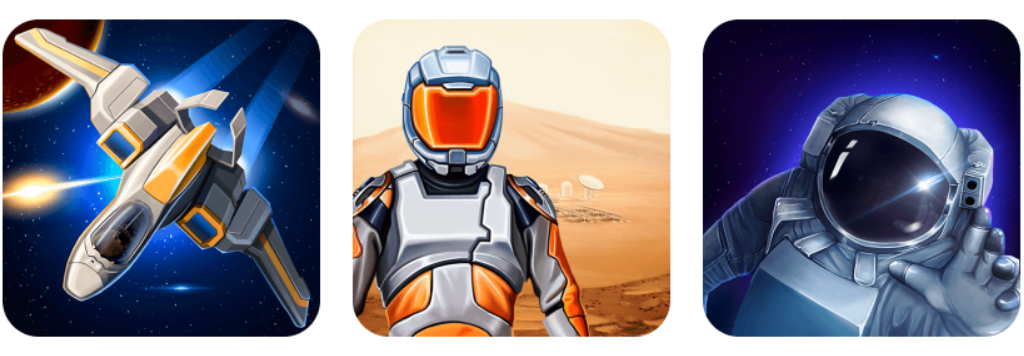
- After that, the A/B tests were run.
As a result of the experiment, the icon with the astronaut showed a conversion growth of +32.1%. This result perfectly shows how vital the icon is in conversion and for the application. Important enough, but also leaves room for other factors.
 Українська
  Русский
  Español