Where to look for trends for visual optimization?
What is visual optimization? Its goals and types.
Today we will understand visual optimization trends - what they are and where to look for them. When it comes to optimizing visual elements, it may seem that the conversation will be about the process of improving the appearance and organization of the user interface (UI) of the application for convenience and attractiveness for users. This includes various aspects such as colors, fonts, the layout of interface elements, visual balance, accessibility, and others. But let's consider visual optimization exclusively within the framework of ASO optimization.
Visual optimization, as an integral part of ASO, is one of the biggest influencers on the user when it comes to app installation. Icons and screenshots are the first things that will be noticed and that can attract attention. Most often, they will be aimed at a user who is not looking for a specific application but scrolls in search of an app with the functionality they need. This is where visual orientation comes into play. That is, the main goal of visual optimization is to attract the user and increase conversion.
Shortly mention about central elements of visual parts:
Icons
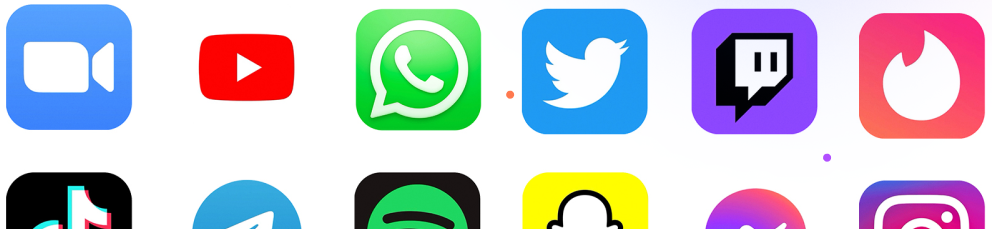
The first and most important part of the optimization will be the icons. This is the first thing the user will see and the first thing on the basis of which they will make a decision, if not about installing, then at least visiting the page of the game or app. The user will interact with it, starting with the App Store or Google Play and up to the moment of installation with the first and each subsequent launch.
To choose the right icon, you need to know:
- Who is your end user
- The genre of your app
- Google Play and App Store icon trends for apps with similar themes
There are also a few more important points that relate directly to the design of the icon itself.
- Minimalism and ease of perception. It is important for you that in a few seconds, the user peers understand what is drawn and the approximate direction of the application.
- No or minimal text. The text on the icon is most often an extra detail that is either ignored or does not bring the desired effect.
- Faces and big eyes. Studies have shown that users linger their eyes on them, paying more attention to them, and, therefore, the likelihood of installation increases.
- Stick to the color scheme of the app and your brand. If the user encounters the fact that the icon uses one color scheme, but in the application it is completely different, then he may get the impression that this is not what they wanted.
N.B. Remember, the logo, and the icon are two different graphic elements. You can read more about this on our blog.
The choice of colors is not always a matter of chance. Behind each color, there is an association, and you need to be able to use it. For example, green, as expected, is associated with money and nature. Therefore, it is preferred by developers of financial services and eco-friendly apps. Blue is associated with calmness, trust, and devotion; red with vigor; orange with fun. Keep this in mind when you create your icon.
Sometimes it can be difficult to choose which icon to make the one. As much as you, the programmers and designers, love the icon, A/B testing should have the final say in an optimal situation. It will show you what will lead to an increase in conversion.
It is expected that there are differences between the icon requirements of the App Store and Google Play. All technical requirements are detailed on the platforms, and do not forget about the dimensions. More detailed information you can find here.
Screenshots
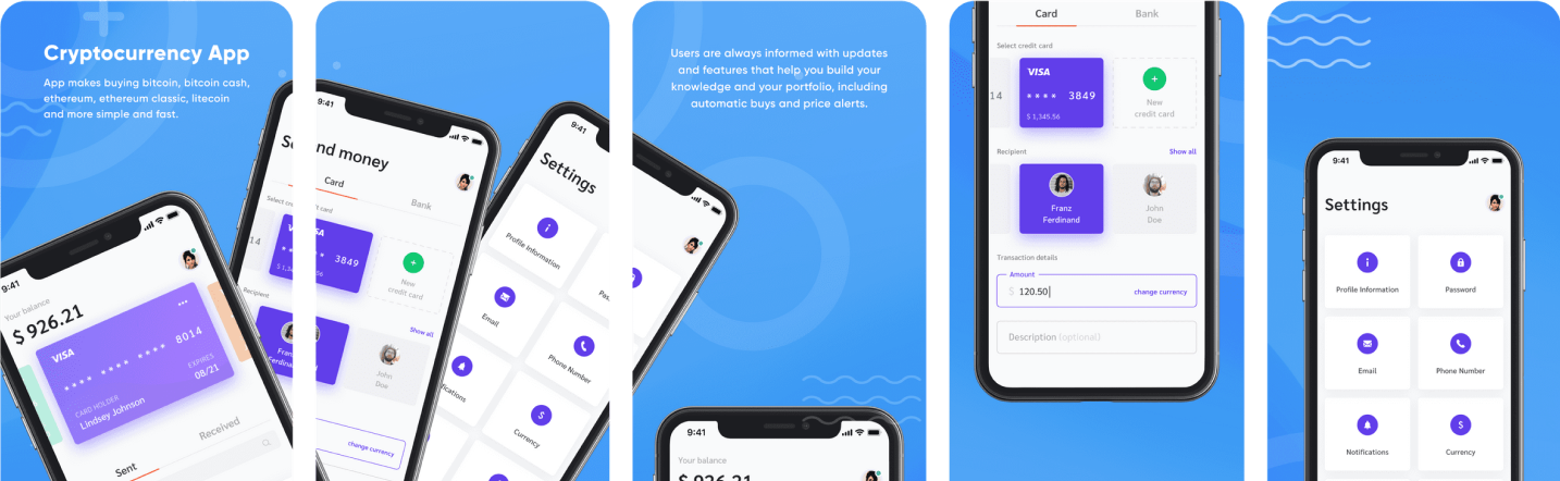
The user has already gone to the app page. The next thing they want to know is what the app is about, how, and what it is used for. This is where we need screenshots since people most often do not read the description. Some clarifying statistics: Less than 2% of Apple App Store users and 5% of Google Play users clicked on the "read more" button. So we leave the description so that the application is positioned as best as possible in the search and move on to the screenshots. It is on them that people look to understand whether they need this app or not.
Important points for your screenshots to be effective:
- You need to understand that the user is unlikely to view all your screenshots, so the first ones will be the most important. Start with the most interesting, exciting, or useful thing you have to offer. Their task is almost the same as the icon to pull the player even deeper into your application. Having become interested in the first screenshots, they can go further and here, you expand the application even more to add up a complete picture about it in the user's head.
- Be precise in your wording. No need to oversaturate the screenshot with text. Remember that the picture is easier to perceive and the user looks at the screenshots so as not to read the description. However, text cannot be dispensed with. Calls to action are great additions to screenshots that can boost your conversions.
- Vertical and horizontal screenshots. It is believed that vertical ones are better because they take up less space. No need to make extra moves to get all the information. But you don't need to change the screenshot format if your game is horizontal.
- Localization. Always localize your app for every country possible. And when localization is written, it means the localization of the visual parts of the application, and not just the text. Adapting to a specific market is very important and significantly affects the conversion.
- Do not show something that will not be in your application. This will make the user feel cheated. As a result, you will receive 1 star and negative feedback.
- Do you have an update? Screenshots are also updated. Add screenshots to show that you are monitoring and improving your app.
- Knowing the trends, as always, will play into your hands. Therefore, a little analytics and now you have already moved closer to creating an even more successful application.
Now let's take a look at the recommendations for screenshots on the App Store and Google Play. All the technical details are indicated for the two companies in a special document, so here we will go through the main ones.
Up to 10 portrait or landscape screenshots can be added to the App Store for iPhone, iPad, Apple Watch, and Apple TV. All 10 must be PNG or JPEG.
Google Play allows you to add up to 8 screenshots for any supported device.
Features of visual optimization of games
It would seem that the games are the same as apps and everything is the same, but no. Much of what is written above applies to games due to the fact that these techniques work on human behavioral habits. And yet games are their own special niche. Therefore, we will now look at what is special about game visualization.
Such basics as minimalism, color saturation, lack of an inscription on the icon, etc. are needed when rendering games and always will be.
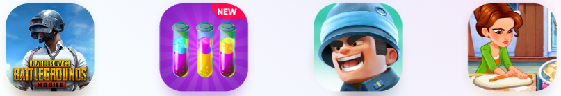
Icon Features
Differences already begin when choosing colors for the icon, since the games are more informal, you can take one very bright color and make it the background. Restraint is more suitable for apps about finance, reading and sports. But remember that the color matches the main color theme of the game.
Things our brain pays attention to:
- Faces and big eyes attract attention, so you can see a large number of icons with people's faces or what looks like a face. If you decide to place someone on your icon, then it's a good idea to add a character from your game and preferably make it look its best.
- Playing with scale as something small among everything big and the contrast of objects is also eye-catching. Both techniques highlight some object and therefore we reluctantly notice it.
- And again about the characters. Characters with an open mouth, a smile or a smirk show a good conversion rate.
It may be a good idea to show part of the game on the icon: part of the plot, who the user will play or how he will see the game.
Screenshot Features
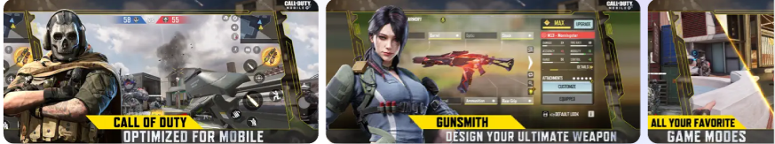
The main rule is to show what will actually be in the game, otherwise you can’t clean up negative reviews later.
Don't show your very attractive menu in screenshots. The main thing is the gameplay. In the first screenshots, show the highlights in your game.
Highlight the most important word in each screenshot and highlight each word with a new color.
The optimal number of screenshots is 5.
What are the current trends in visual optimization?
The constant struggle for search listing positions and download numbers will inevitably lead to one strategy working better than another. And so it goes with visual optimization, which is an integral part of this race. Let's see what's trending right now.
There are trends that will not go away and will be constant one of these is color saturation. One would like to say that if everyone is bright, then why should we be bright. We are forced to upset you, if you choose a faded palette, then you will be scrolled through and not noticed. Soft tones may be present, but they should still be closer to bright.
A classic that goes against the tide. Black and white. These two colors are always in the top colors.
Although it should be noted that white is confidently leading everywhere from the background of icons to the text on the screenshots.
Less is more! Minimalism crept up unnoticed and also quietly became a serious trend in the App Store and Google Play. Why? The answer is simple, consumption rate. Life has accelerated, there is a lot to do, and the number of hours is still 24. Therefore, no one will stop and read app descriptions for so long, even videos fall under this characteristic. All attention is paid to icons and screenshots. You need to understand everything quickly and reject it even faster. Therefore, minimalism began to bring more conversions.
Only up! Vertical screenshots are preferred to horizontal ones. All for the same reason of minimalism. More vertical screenshots are displayed on the page and the user can quickly navigate.
Emotional interactivity. Many screenshots are made with the expectation that you will have a positive reaction, and that it will be your first association. Smart, isn't it? In this way, they win your trust a little.
Where to find niche visual design trends?
On the app stores - go in, look at the search results, design and color schemes.
In mobile analytics tools - in two clicks you can highlight the main solutions for the visual range of the application niche.
Features of the visual design of dating apps:
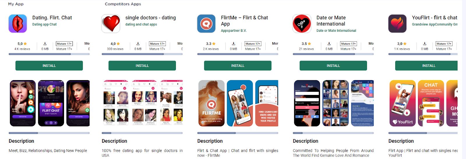
- red and black shades
- use of dating and relationship symbols
- screenshots also have common features in design.
Features of the visual range of meditation apps:
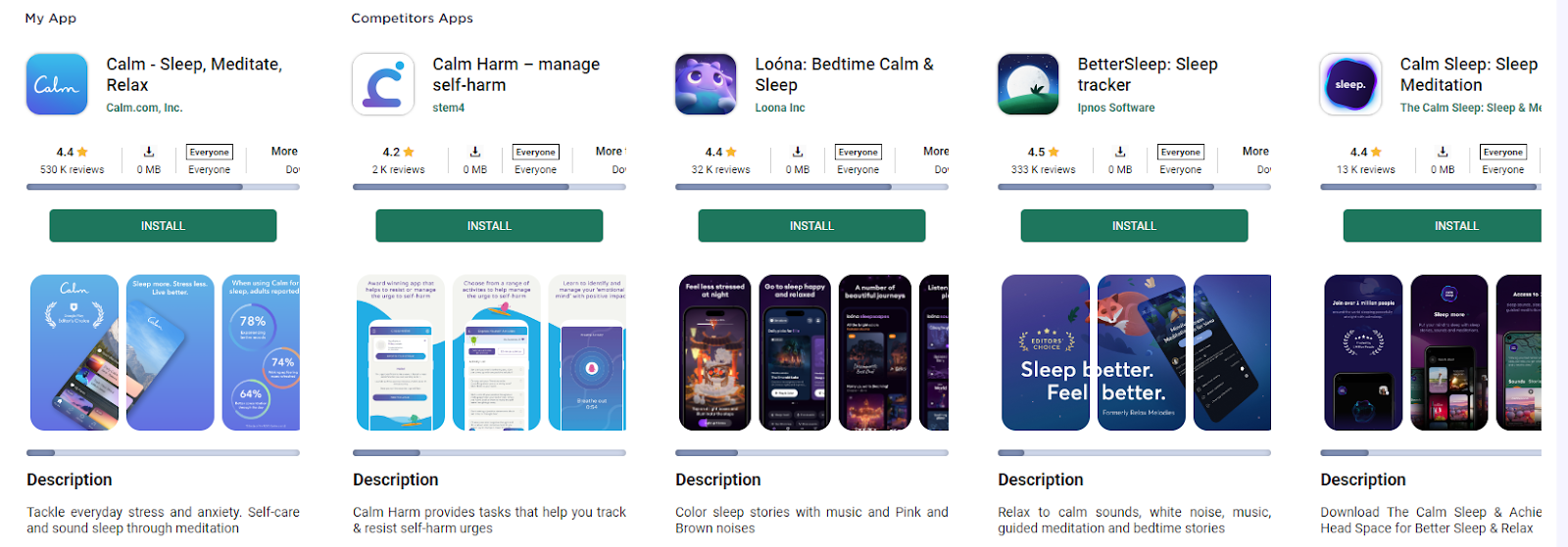
- colors in the blue-violet spectrum
- associative row of icons with sleep, calm, night
- screenshots are designed in approximately the same style and color scheme.
To make it easier to find ideas for visual optimization, track trends, and general concepts, we recommend that you do not forget about mobile analytics tools. Visual Comparison from ASOMobile will help you with this.
Realizing the importance of icons and screenshots and the presence or absence of videos on your application or game page, we focus our attention and efforts on finding an answer - which creatives will cause users to respond in the form of installs. We hope that our tips will help you a little with this.