ASO for travel apps
The topic of ASO for travel apps is now more relevant than ever because, finally, COVID-19 is history, and we continue to discover a world without borders. The revival of the tourism industry was expected, so optimizing applications will help us to withstand the rising wave of competition and, even better - to surf that wave, so let's go!
The pandemic has taught us so much that all life is in a smartphone; you should not even expect that the trend will change. Now we want to travel with a mobile phone in hand. Agree, how far we have gone from searching for air tickets and booking hotels through booking.
Find interesting places? Meet friends? Hire a surfboard? Sign up for a meditation lesson during a retreat. Understanding the level of our interaction with the world of mobile apps, you certainly understand the term digital intoxication, but such is the modern world.
The tourism sector of mobile apps
Now it's time to talk about numbers. Despite the time of isolation and quarantine, the tourism industry continued to impact the global market. According to the World Economic Forum's Digital Transformation Initiative (DTI), from 2016 to 2025, digitalization in airline tickets, travel, and tourism is expected to generate up to US$305 billion for the industry. The times when the user will take the opportunity to go to a travel agency to buy a tour are over, now, everyone needs a solution in a smartphone. According to a Google Travel study, 74% of travelers plan their trips online.
Competition - where monetization is possible, it will always be. It is worth noting that we will fight for our users in this area of travel, not only with other apps. Here the situation is much more severe - desktop and mobile versions of sites will take over some of the users, plus we do not exclude those committed to more traditional leisure planning options through honest communication with travel agents. If our application has duplicate resources (or they were primary sources), such as a web page, we will take potential users from ourselves. That is why the ASO optimization strategy is firmly in the first place here, although promotion has its own specifics, but more on that later.
The tourism industry is diverse and widely represented - flights, accommodation, car or other transportation rentals, itinerary planning, sightseeing planning, navigation, and more. Therefore, it is pretty tricky to talk about the all-in-one, and even the giants of travel applications choose some kind of stripped-down format for themselves, which will close users' needs as close as possible in spirit.
For example, the very popular Skyscanner app, which started as an air ticket aggregator, then connected a car rental price aggregator to its functions and cooperated with Booking to make it possible to rent accommodation for the dates of interest to us in the right place. During the pandemic, this platform also dealt with information support for travel, restrictions of each country, special requirements for crossing borders, and so on. We can still come across tips for places to visit based on our previous user experience. As for us, this app can serve as a benchmark for diversification and competent construction of a growth strategy.
ASO strategies for our travel app
We start our steps in optimizing the travel app by studying the market and ourselves against the background of competitors. By the way, did you know that taxi service apps are also related to travel?
Why is it so important to define yourself before starting and not during the creation of the application? Due to the diversity of features and offers, market analysis must be carried out very carefully, clearly defining what exactly we will offer users and who our direct competitors are. A ticketing app won't be a direct competitor for an audio tour app. An application's life path depends on its niche and future prospects.
As we already mentioned, the competition between web and mobile users in this category is unusually strong, so it is worth laying in your strategy a careful transition of users from the web version to the mobile version, with obvious benefits and maintenance effects for them. The user will need to use the app even after the start of their journey, and not just at the planning stage.
Forming an MVP application as part of ASO optimization
At the moment of transition to the page of our application, regardless of where the users came from (from the web page, advertising, mailing, search results), our task is to attract their attention with a clear call to action. That is why self-determination among competitors and highlighting the app's main functionality to appeal to the user is the most critical stage in working on the page. We do not diminish the importance of text optimization for the purpose of indexing and positions in search results, but when the users are already on the page, our task is to explain to them very quickly and clearly what exactly we offer with our app.
Please note that all subsequent steps in forming an optimization strategy will focus on screenshots, not icons. And it will soon become clear why.
Let's look at examples of competitors and niche leaders. When visiting the app page, each has one thing in common in the screenshot design - CTA. A call and appeal to the user, which in one phrase explains what he can count on when using it.
“All travels in one app,” “Plan your next trip,” “All travel plans and itineraries”...
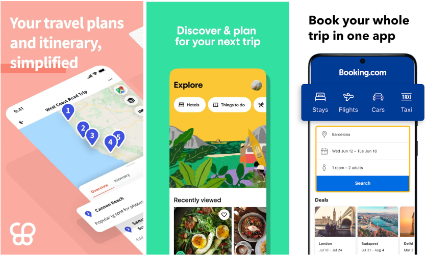
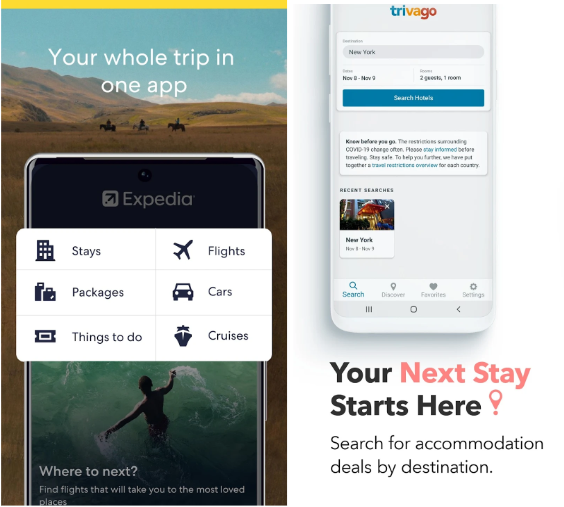
A review of the Niche Tops will help us form the main points of the strategy for further development:
- What functionality do competitors focus on, and what will we emphasize (Will we have many functions in one app, or will we focus, for example, only on searching and booking accommodation and then add tips on tourist places depending on the geography of the user's search?).
- Let's define the style of screenshots - even a brief look at the category leaders shows us the vertical style of design, the use of maps, destinations, planes and trajectories, and photos of tourist places.
- And in addition to all of the above, we must definitely find out how we will differ from them.
By the way, we can use the Visual Comparison tool from ASOMobile, which will show us niche trends and geographical features of visual optimization in different countries.
Call to action feature for travel apps
- Emotional contact.
The tourism sector is very much tied to the emotional coloring of contact with the user. After all, when traveling, people are looking for a way to quickly move from point A to point B. For the most part, users of the tourist category will look for experiences and the happiness of being in a dream place, and if all this can be done more accessible, cheaper, and more comfortable with the help of an application, it’s worth doing on this emphasis. If we analyze what exactly the industry giants promise users, then a positive and comfortable experience that will give unforgettable emotions will be one of the first.
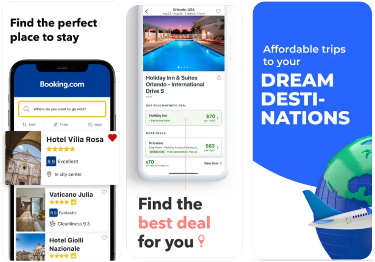
When planning a trip, it is a common wish that everything goes perfectly. After all, rest is always long-awaited and happens so rarely that you don’t want to make mistakes in planning it or any unforeseen situations. That is why we can position our application as the one that will provide precisely what you need - the perfect place for relaxation, vivid impressions, relaxation, or a boost of energy.
- Business approach.
We can engage users with a clearly structured approach, that everything is accounted for, written down, and planned. Short focus inscriptions containing the application's numerical characteristics - the number of destinations, the number of hotels available for search and booking, 24/7 support.
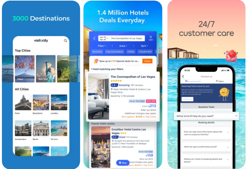
- Exclusive approach.
When we offer our users to stop trying to independently search for a hotel or air ticket reservation to get the best possible price offer or some special conditions, we take this responsibility upon ourselves.
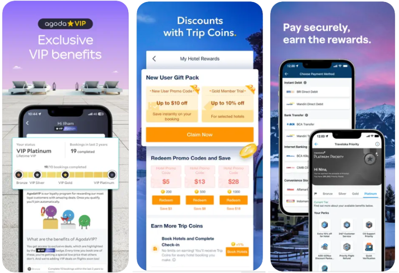
It is common to see a combined business approach and an exclusivity approach, as they will be typical of the target users. Finding a mixture of everything is less common since it is not worth the risk of trying to get everyone - we will scare someone away with an inappropriate approach to CTA.
Screenshot style for travel apps
With the help of Visual Comparison, you can see the design style of competitors and Niche Tops in one click, which will allow us to evaluate all approaches in visual ASO, highlight something in common, and find our own way.
Almost all screenshots of competitors necessarily contain:
- travel elements (airplanes, trailers, cars)
- maps with destinations
- the functional part about the ability to choose a flight, hotel, or car
- photo of rest, tourist places, and sights.
Geography and localization
In addition to the customary approach to optimizing for iOS and Android platforms, it will be mandatory to pay attention to localization and cultural characteristics. When researching competitors, we noticed the remarkable popularity of adapting visual elements to specific geos (other color solutions, photocells, or screenshots) was not reflected in the current situation. The usual approach is to personalize focus labels, all other visual content is the same for all geos. Perhaps we can find our growth points in this and try to apply a different approach, taking into account the cultural and other characteristics of the region.
And since we have already discussed the specifics of geo, it is also worth mentioning the difference in user behavior depending on the platform. Developing different creatives for testing in different app stores can give us a significant boost.
Promotion of travel apps
Promoting apps of this kind is as closely tied to the user's portrait as possible. If our app is designed for people who prefer the style of downshifting, leaving civilization for a retreat somewhere on a lost island, then our help may be limited to background information about dangerous diseases, booking a yoga lesson on the shore, or renting a maxi for snorkeling. If we expect our target users to prioritize comfort and minimize hassle, the application will interact with them at all stages - planning, traveling, returning home, and making plans for the following summer. The portrait of travel app users can be drastically different, but the most important thing we will stick to is creating a companion app connection. A sense of interaction and support for the users can arise at the time of use and with the help of push-up notifications during their journey. Personalization is the key to promoting applications of any category today.
Social networks are a place that was created to share your experience and emotions. The frequency of posts from travels shows that for travel apps, this is the most correct way to introduce yourself to future users. Content, and nowhere without it, will significantly help this matter - telling about travel stories, possible adventures, and emotions, an honest and best way of advertising.
By creating loyalty programs for our users, we increasingly tie them to our product. Why book tickets anywhere if you still have accumulated bonus miles from your last vacation on your smartphone? Or, if we meet our application on social networks, we will provide this user with a welcome bonus.
Continuing the concept of a travel companion app, you can personalize the experience as much as possible by providing tips and overviews of where the user is currently located. By advising places to visit, a restaurant for dinner, or a 3-hour layover at the airport, this manifests care and the formation of loyalty.
Trends of 2023 in ASO for travel apps
- Economic situation.
The industry has had great optimism since the pandemic restrictions, but the crisis is forcing users to spend more wisely and carefully. Accompanying the user in a crisis, helping to save money, and offering more budget options should become part of our application.
- Personalization.
Enough has already been said about it, not only in the context of tourism apps (you can read more in the article). But personalization in travel apps is the key to survival and precise segmentation of the user field; we find our user and direct all efforts to it.
- Freemium or subscriptions.
If we are talking about app users, we mean not a one-time use. People who choose travel as a way of life are our target audience. For them, it is worth developing a correct monetization system through in-app purchases and subscriptions. After all, virtually any app designed for frequent use has the potential to be subscribed as a monetization strategy.
- Loyalty program.
Based on the first point about a frugal approach to travel, a loyalty system in the form of bonuses and cashback will be an excellent approach to increase our application's attractiveness in users' eyes.
- Super Apps.
We have already mentioned super apps in the context of the Chinese market, but it is the travel niche that is very promising for their emergence in other countries. Applications that can close all-in-one literally in one click - from tickets to sightseeing tours - will become increasingly competitive on the market, and the future will be with them.
- AI and the future of tourism.
Already we can puzzle GPT chat with the search for the best route in Milan to eat ice cream and walk through the boutiques. But of course, it will not be able to buy tickets, book a hotel and pay in a cafe. A competent combination of AI capabilities and the functionality of our application will create a soft interaction on the user's path (here you can understand both the physical path - the journey, and the UI when working with the app), not overloaded with push-ups notifications and really helping the consumer to organize everything without much effort.
In general, the industry promises us many opportunities and challenges because people who dream of seeing the world will be our potential users, but we will have to try as much as we can to help them with our product. But we do not despair and open up new horizons for our app, just like our beloved users.
