Visual optimization - scenarios and TS for designers
Well, let's talk about visual optimization, its scenarios, and the creation of technical specifications for designers. If you actively follow our publications, then you are most likely familiar with visual optimization and some of its features. We will not retell everything here, but a small dive into the topic for those who encounter it for the first time is necessary. If you want a more detailed analysis, then it can be found in our article on this topic.
We will rather be about the stages of interaction between a developer, marketers, or an ASO specialist with a team that is responsible for visual elements and visual optimization.
Visual optimization is the process of optimizing visual elements to increase app conversions. By visual elements, we mean:
- icons
- screenshots
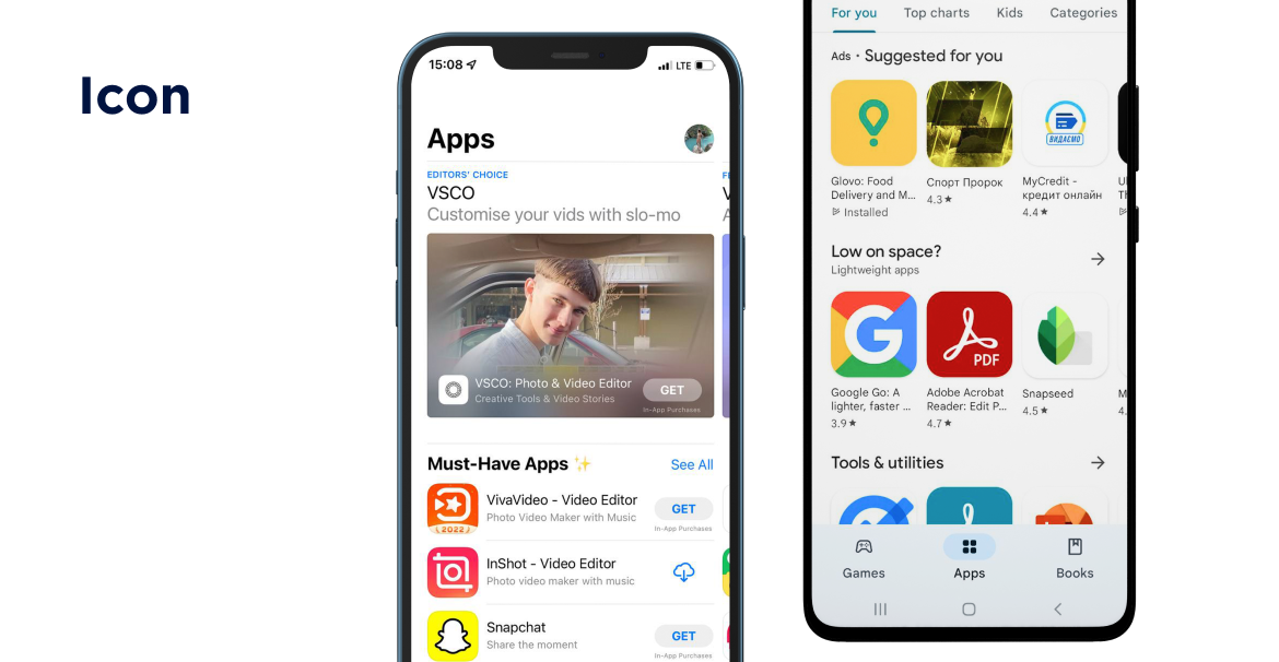
Everyone already knows the definition of an icon, or they can formulate it themselves, so let's better analyze what it serves for. The icon is the face of your application, and, therefore the first thing the user sees. So it should interest, grab attention and cause a desire to go to the app page. Visual optimization strikes a balance between these two factors and helps you adapt your icon to the user. You can read more about icons in our article.
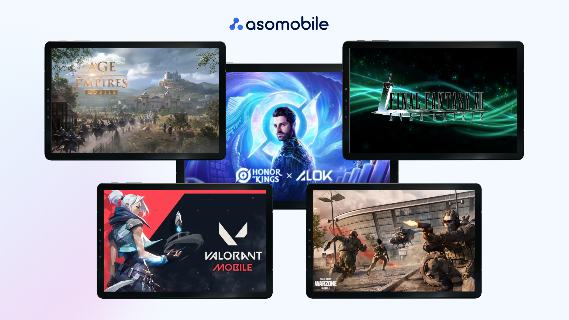
Screenshots are a source of information and your opportunity to convey it to the user. Most often, screenshots are the decisive visual factor of whether your application will be installed or not. The most exciting thing is that these will be the first two, sometimes three, pictures, and then the user rarely enters. Here is your task to put the maximum amount of information in the first screenshots and not oversaturate them. Naturally, we remember that the screenshot should display exactly your game and its visuals in a different way, with deletion and one star. A little more information about this is here.
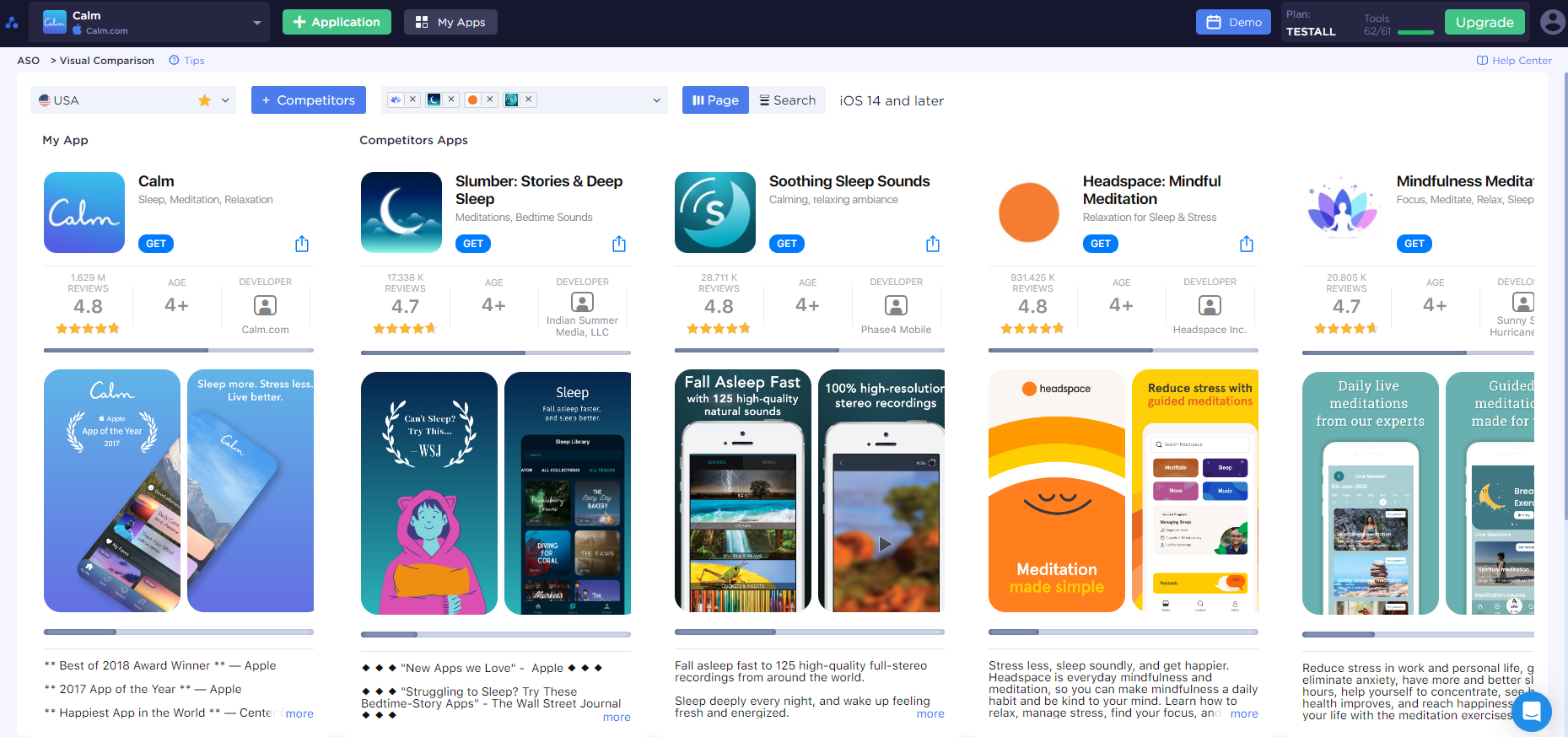
And, of course, all this is driven by the general theme of visual optimization, that is, trends. The concept of trends cannot be removed from visual optimization. They are the primary tool at work and the reason for the existence of visual optimization. It is the understanding of trends and their analysis that can provide you with high-quality icons and properly styled screenshots. If you are interested in visual optimization trends, click on Visual Comparison.
Scenarios of visual optimization. How? What for? Why?
Visual optimization does not start in a snap. It has a plan, or rather a script; later, it will be clear why. How does this happen? An agency that deals with ASO optimization receives an order from a client to optimize the application, or it can occur within the company that develops the game. After all, all that is needed for this is designers, ASO specialists, and marketers. After it becomes clear what the customer wants, a long process of researching every aspect of the application and others as it begins. We're here for the visual optimization part. It should be noted that ASO is not a one-size-fits-all answer. The same is true for the visual component. It all starts with research into every aspect of visual optimization. The visual of games or applications of the same genre is viewed visual analysis of competitors and the most downloaded applications. During this process, there will definitely be similarities, and here they are; this is what the focus will be on. From such elements, the formula for the success of your project will be derived, and scripts will be created. The best does not mean that they are well combined with each other. Since the sample is quite large and varied, there may be several optimal options for the same icon. For this, there are scenarios, and several possible design characters are created. For example, screenshot layouts, horizontal for games and vertical for apps. Different styles of the icon are minimalistic, 3D, or realistic, or maybe the concept itself needs to be changed. This is how several possible scenarios are put together, what screenshots, icons, etc., might look like. After the nth number of scenarios are done, a rally is scheduled with the client or team, where each of the scenarios will be considered until only one remains.
Why will there be several of them if you can take the best from other projects and that's it? Most likely, the best Frankenstein will come out, and not a game or app that will be TOP-1 in searches and recommendations.
The work starts with answers to the following questions:
- Your target audience:
- who is your user?
- what do they like?
- what do they want?
- How can your app help and be useful?
- How will your app solve user problems?
Where to look for answers?
In the search results - competitors, trends, and fashion.
In the app interface - how do you differ from analogs
Sources of inspiration - from the next niche to Pinterest
The scenario is your visual optimization guide. TS (test specifications) is always a continuation of the script.
The scenario contains the following:
- Description of the target audience.
- Purposes and possibilities of the app.
- Ideas for visual elements - references and examples.
- Captions on the screenshots - call to action, focus captions.
- Technical requirements.
- Additional information - brand books, corporate colors, fonts.
Let's take a detailed look at how visual optimization is done. Everything starts in the same order in which the user begins to interact with the app. First, the icon and then the screenshots. The first thing that happens is the analysis of the icon that the game currently has and its comparison with trends. Then, according to the trends, several variants of the icon are thought up, and each variant is described. The same is done with screenshots. We also need to remember that we have two platforms. And each platform has its own requirements and parameters for icons and screenshots, which in turn adds a few more options.
Test specifications for designers
After creating scenarios and fixing one of them as a further plan of action, we hand it over to the designers, but before that, it needs to be supplemented with more technical information. For this purpose, each option was prescribed with a description of the style and the provision of references. In fact, part of the TS is already present in the scenarios, but only a part. Here we supplement our semi-finished test specifications with dimensions in pixels, image format, number of layers, and so on and so forth. This is prescribed for both icons and screenshots. Accordingly, for the two Play Market and App Store sites.
* Each TS by default, contains the main guidelines for visual elements from the App Store and Google Play
The TS pattern may look like this (but can also be modified to suit your vision and needs):
- Task:
- icon
- screenshots (5 pcs)
- icon and screenshots
- App Store - App Store and/or Google Play
- App Link
- Examples of visual elements of competitors that were chosen as the basis for visual optimization (based on the scenario).
- Captions for screenshots
- Link to original graphic files (screenshots of the app interface).
- Notes.
What about Artificial Intelligence (AI)?
Can artificial intelligence help us, or is it just a toy? An easy answer is yes, but we're not looking for easy answers. How exactly can AI help us in working with visual elements? At the moment, this is helpful with the formulation of TS for another artificial intelligence and the rendering of this TS. It should be noted that this is still AI, and most likely, the designer will have to correct what happened.
What AI can help us with this? DALL-E 2 is very easy to learn and generates decent images, although not TOP ones. Better ideas come from Midjourney, but there are a few problems. First, it's only available on the Discord program at the moment. Secondly, after the images are generated, they are automatically added to the Midjourney Discord group; that is, they become available to the public. Therefore, DALL-E 2 is currently the best choice for business use. Let's set aside the topic of AI for a more in-depth discussion in the future.
How to understand that we have a "jackpot"?
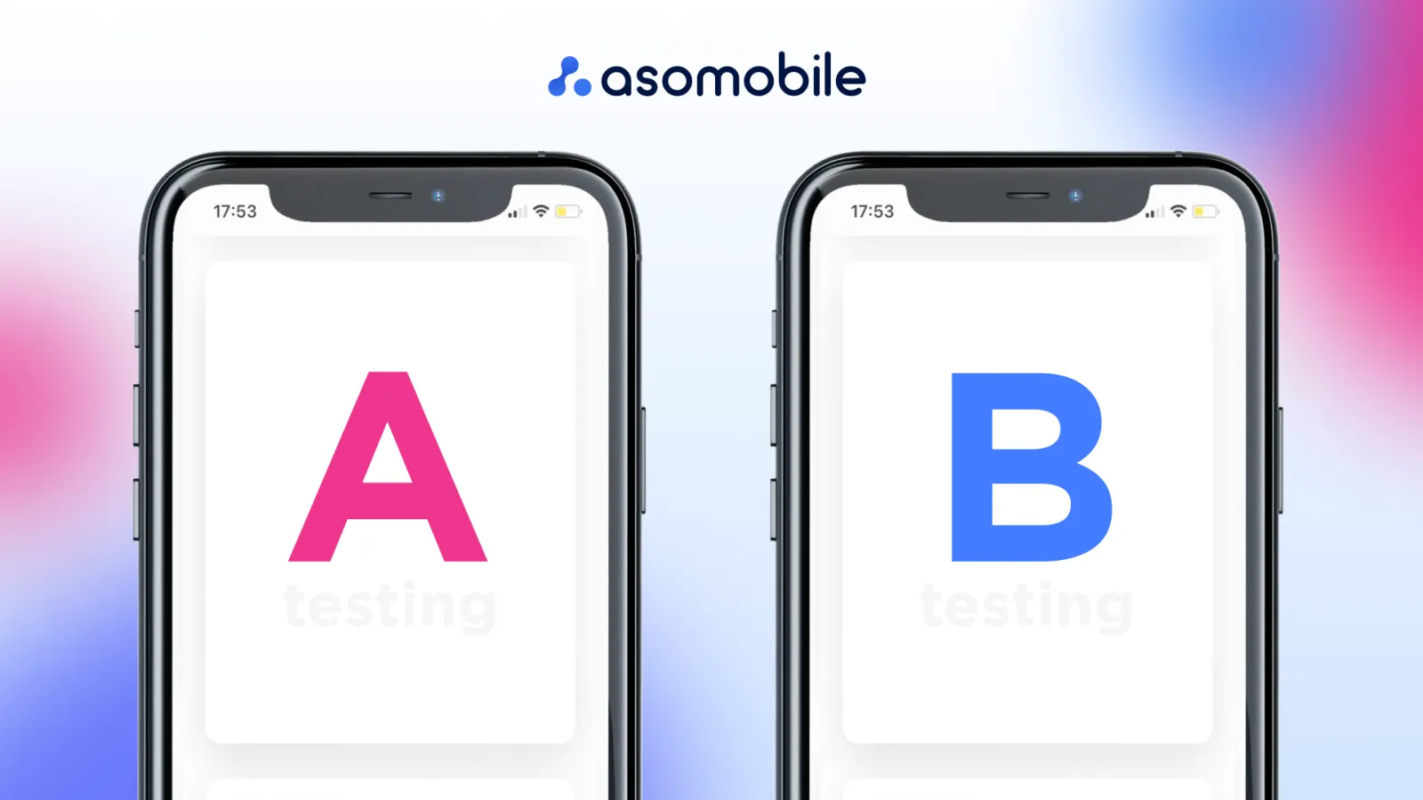
It's simple, A/B testing. A/B testing is testing multiple variations of an element (icon, video, text, or screenshot) on your application page. During this test, we get an understanding of which of the options attracts more users, therefore, increasing the conversion.
A/B testing not only gives you an idea of which visual solution was better but also gives you an idea of who your target audience is and how accurate you were in predicting it. This data can be used in your following projects or to improve the current one. Information is a resource that pays good dividends if used correctly.
Results
Visual optimization, as one of the main components of ASO optimization, gives us an understanding that just drawing a cool icon or making an excellent video may not be enough today. If you want your app or game to attract attention, then visual elements will do it. Unfortunately, good gameplay or content doesn't show up on the icons and isn't very obvious at first. That's why ASO exists to attract attention and increase conversions so that your app gets known and gets the attention it deserves.
