App Store page conversion rate is the gap between those who found you and those who installed you. A small gap means the page is working. A large one means something isn't convincing. This is where CRO work begins: not driving traffic at any cost, but figuring out why people leave.
If two out of a hundred visitors install, you can keep scaling visibility, buying traffic, and climbing keyword rankings. It will help, but not much. The problem isn't that too few people find you — the problem is that the page isn't closing the deal.
In this article, we'll cover how to tell a visibility problem from a conversion problem, what to look at in metadata and visuals, and how to build an A/B testing system that provides answers rather than raising new questions.
What is the app store conversion rate, and why does it matter?
App store conversion rate (CR) is the percentage of users who visit your app page and install it. The formula is straightforward: installs divided by page views, multiplied by 100. But the number itself only becomes useful when you know what's driving it — or killing it.
CR is the primary health indicator of your product page. A strong organic app install strategy means nothing if the page fails to close. You can rank for every relevant keyword and still lose users at the moment of decision. That's why CR sits at the center of any serious app store optimization strategy: it tells you whether your page is doing its job.
According to AppTweak, the average CR in the US App Store is around 25%, but the range across categories is vast — from 1.2% in Board Games to over 115% in Navigation. Before drawing any conclusions about your own numbers, benchmark against your category. What looks like a conversion problem might just be a normal rate for your market.
ASO and CRO: conversion as an extension of visibility
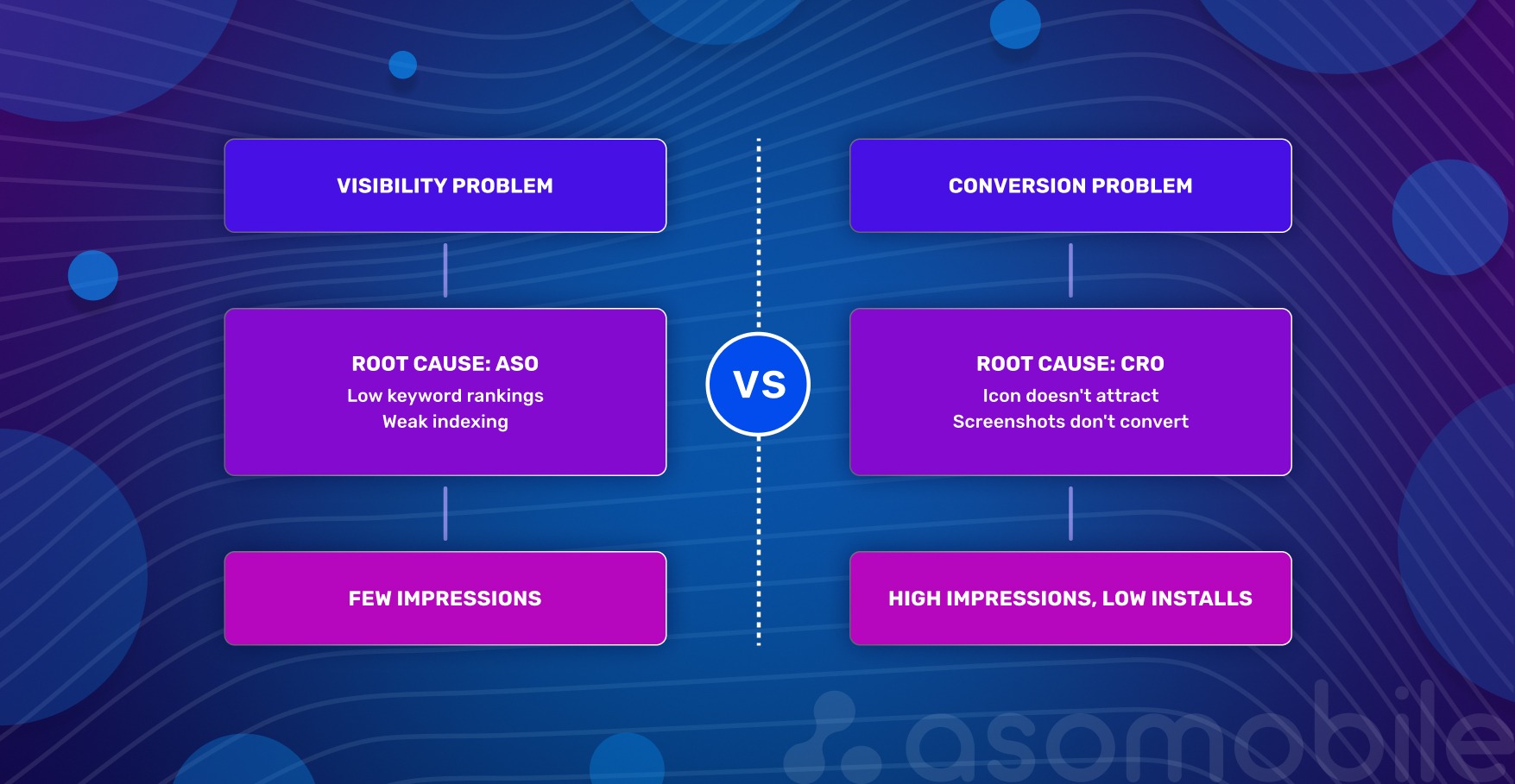
App growth has two dimensions: being found and being chosen. These problems have different natures.
A visibility problem is when people don't find you. Low rankings for important queries, weak indexing, and absence from editorial collections. The root cause is ASO: not enough targeted traffic reaching the page.
A conversion problem is when people find you but don't install. Users arrive, look at the icon, scroll through screenshots, read the description — and leave. The root cause is CRO: the page doesn't convince.
How to tell them apart in practice? Check analytics: many impressions, few installs — conversion problem. Almost no impressions — visibility problem. The key is not to look at these metrics in isolation. Low CR can mask traffic issues, and weak visibility makes even a great page pointless.
For strategy, this means one thing: you can't improve conversion without traffic — there's nothing to test on. And you can't keep scaling visibility if the page doesn't convert — that's pouring money down the drain. ASO brings people to the page. CRO helps them make a decision.
Metadata: the foundation of conversion
Metadata is the foundation that determines whether a search will find you and whether a person will want to tap the icon. The key is not to get carried away with keywords at the expense of meaning.
Title. The name is the strongest signal for algorithms. A good title answers two questions: who we are (brand) and what we do (core function). Working formula: brand + 1–2 keywords. If the name is cluttered, the user will scroll past.
Subtitle. The subtitle directly affects CTR. There's no room here for generic phrases like "the best meditation app." Better to write: "Meditation, white noise, and breathing" — the user immediately understands what they're getting. Important words go first: on small screens, the subtitle gets cut off, and the last characters go unseen.
Keywords. A field only the algorithm sees. Select words that reflect different ways of searching for the app, including misspellings. Don't repeat what's already in the title and subtitle — on iOS, this carries no weight.
Description. The one element that isn't indexed is what converts those who are almost ready to decide. This isn't the place for keywords — it's the place for specifics: what problem we solve, how exactly, why better than others. The first two lines answer the main question, because that's what's visible without tapping "more."
Texts prepare the ground, but don't sell on their own. That's where visuals take over.
Visual elements: from icon to video
The decision to install is usually made by the eyes. Visuals work without a pause for reading — and the faster we explain why someone needs our app, the higher the chance they'll tap "download."
Icon. The icon is the main negotiator in search results. According to SplitMetrics data, icon optimization can boost conversion by up to 25%. Color matters too: in the Chinese market, red yields an additional ~5% in installs.
Three rules: simplicity, contrast, and connection to the app's function. The icon must read clearly on a small screen, not blend into the background, and immediately convey what the product is about.
Screenshots. The app's storefront. The first 1–2 screenshots decide almost everything — according to the same SplitMetrics data, about half of users look only at them.
What makes screenshots effective: large, readable captions without zooming; a single, connected story, not a random set of screens; adaptation for dark mode — many users use it by default; key advantages and commercial triggers in the first screenshot.
Video (app preview). Video builds trust and shows the app in action. The first 10 seconds are the most valuable: after that, the person has either engaged or left. Video plays without sound — any explanations must be on screen in large text. And show the result, not the interface: the person should be able to imagine themselves inside the app.
Ratings and reviews. This is the only page element that affects conversion before the user even visits the page: the rating is visible directly in search results, next to the icon. According to AppTweak, apps with a rating below 3.5 stars rank lower for keywords, and 90% of featured apps have a rating of 4.0 or higher. Practical benchmark: a rating below 4.0 is a barrier to CR, regardless of screenshot and icon quality.
Ratings don't grow on their own. The best moment to request a review is right after the user has successfully completed an action inside the app. Not at a random moment, not at launch — that's annoying. And the key point: respond to negative reviews. A potential user reads not just the review itself, but the developer's response — it's a signal that real people stand behind the product.
In-App Events. Since 2021, the App Store has allowed developers to publish events directly on the app page, including promotions, updates, tournaments, and seasonal content. They appear in search results and affect conversion — especially for users already familiar with the brand, who see activity as a signal that the product is live. An event relevant to the user's query can appear in search results as a separate card — an additional touchpoint without changing the main page.
Apps that systematically test icons, screenshots, and videos consistently achieve higher conversion rates than pages that change only once every six months. Not through one lucky decision, but through dozens of small improvements.
How to audit a page for conversion problems
Before changing anything, you need to understand what you're actually dealing with. The checklist below isn't about "like it or not" — it's about objective signs of whether an element is working or not.
1. Title. Is the name understandable without context? Does it contain 1–2 main keywords? Does it get cut off on an iPhone SE? Is there a word the user will read as a promise but won't find inside?
2. Subtitle. Does it explain value in 2 seconds? Does it talk about benefits or list functions? Compare: "Meditations and breathing practices" vs "A catalog of meditation and breathing techniques." The second is about function, the first is about benefit.
3. Icon. Is it recognizable at arm's length? Could it be confused with competitors — check in search results next to them? Is there an "anchor" — a detail that catches the eye when there are many icons?
4. First 2–3 screenshots. Is it clear what the app does and why it's better than others? Language of benefits, not functions: "You'll be able to focus" vs "Concentration and meditation practices."
5. Video. What happens in the first second? Logo or black screen — the viewer is gone. Is there text on screen explaining the user's problem? Check without sound.
6. Description. Are the first 3 lines a specific problem or a greeting? "Welcome to the best meditation app" — filler. "Can't quiet your thoughts before bed? Try a short meditation" — that hooks.
7. CR by traffic source. Is there a big difference between conversion from search and from recommendations? A large gap means the page responds well to specific queries but sells itself poorly without context.
8. CR after updates. Has it happened that after changing the icon or screenshots, conversion dropped, but we didn't notice, because installs grew due to traffic? Look at CR separately, not tied to total install numbers.
9. Retention as a listing honesty check. High CR with low D1 — users come, install, and leave quickly. This almost always means the page promises something that isn't inside. Look for a gap between promises in the title/subtitle/screenshots and the real experience.
10. Comparison with competitors. Open the search for the main keyword, and look at the icons and names next to yours. What do they have that you don't? Maybe everyone else shows prices in screenshots, and you don't? Or does everyone's subtitle start with a verb, and yours starts with the brand?
11. Rating. What's our average rating right now? If below 4.0, that's a barrier to reducing CR regardless of screenshot quality. When did we last request a review inside the app — and at what point in the user journey?
12. CR comparison with category benchmark. Is 15% CR good or bad? Depends on the category. Without a market benchmark, it's impossible to know if there's a problem. Check your category benchmark in ASOMobile and compare it with your own number.
CRO approach: how to test and improve conversion
Without data, choosing between icon A and icon B is guesswork. With data — it's CRO. The App Store has a direct native tool for this.
Product Page Optimization (PPO)
PPO is the App Store's built-in A/B test for a page's visual elements. We create up to three alternative versions, show them to a portion of the audience, and see which delivers better conversion. Only the icon, screenshots, and video can be tested — metadata isn't part of PPO. Each variant undergoes Apple moderation, and the results are visible in App Analytics.
PPO isn't a replacement for ASO — it's the next step. ASO brings the user to the page. PPO handles getting them to tap "download."
How to launch an A/B test in App Store Connect
Go to "Features," select "Product Page Optimization," name the test, and create up to three variants — for example, three icon options or three sets of screenshots. Choose the percentage of traffic to allocate to the experiment and set the duration. The minimum duration is 1–2 weeks; a shorter test produces unreliable results. Apple will suggest how long is needed to achieve the desired conversion improvement with at least 90% confidence.
What to test first
Three things deliver the fastest results:
- Icon — affects whether we get noticed in search at all.
- First three screenshots and their order — these are what appear in search results, and they most often determine whether someone taps "install."
- First frames of the video — video plays without sound, and if the first seconds don't hook, nothing after matters.
Custom Product Pages (CPP)
Beyond PPO, there are custom pages. These aren't A/B tests — they're separate versions of the page for specific segments, keywords, or campaigns.
At WWDC 2025, Apple announced that CPPs can now appear in organic search. Here's how it works: in App Store Connect, select keywords from your main Keywords field and link them to a specific custom page. When a user searches for one of those terms, they see the CPP instead of the default page.
Two important limitations. First, you can't add an arbitrary word — you can only choose from what Apple suggests based on your keyword field. Second, CPP doesn't create new visibility: if the app doesn't rank for a keyword, linking it to a CPP won't help. CPP only changes which version of the page the user sees — it doesn't affect whether the app appears in search at all.
This turns CPP from a supplementary paid tool into an independent organic asset. You can create different pages for different intents: one for people searching "budget planner," another for "investment tracker." Adapt for seasons (a Black Friday page), for localization, or for a specific marketing campaign.
The systematic CRO approach works on two levels. PPO — regular hypothesis testing: what if we change the icon color? Swap the screenshot order? Add large text to the video? CPP — personalized pages for different queries and audiences, including organic.
Metrics to track before and after changes
Every change on the page is an experiment. To determine whether a hypothesis worked, you need a set of metrics captured before, during, and after the test.
Conversion Rate (CR) — the main indicator of page performance. Calculated simply: number of installs divided by number of page views, multiplied by 100. Data source — App Analytics in App Store Connect.
CR means nothing without category context — benchmark data by category and country is available in ASOMobile. A 15% CR for a business app is a failure; for a game, it's normal.
Numbers without dynamics are also useless. So we keep a hypothesis log — a simple table: what exactly changed, when, what CR was before, and what it became after. Without this, it's impossible to repeat success — or to understand what caused it.
Tap-Through Rate (TTR) — the percentage of users who saw your icon in search results and tapped it. The metric between visibility and conversion: we were shown, and we were installed. Answers the question of how well the icon and name attract attention while a user scrolls through search results.
Low TTR with high rankings — the icon doesn't hook, or the name doesn't explain the purpose. Direct reason to A/B test the icon. High TTR with low CR — we attracted attention, but the page didn't convince. The problem is with the screenshots, video, or description.
Retention (D1, D7, D30) — a listing honesty check. If a user installed the app and deleted it the same day, the job is only half done. Low retention almost always means the page promised one thing, and something else was inside.
Look at retention together with CR. If CR is high but D1 is low — the problem isn't the page, it's the product or how we're positioning it. That means revisiting onboarding or metadata promises, not redrawing screenshots. If both metrics are low, work on both simultaneously.
Tools. Basic metrics — CR, TTR, installs, views — are in App Store Connect, App Analytics section. That's enough for day-to-day monitoring and launching PPO tests. For deep keyword analysis — finding them, grouping them, and tracking their positions — use ASOMobile. It's an additional data layer on top of Apple's analytics.
Don't start changes without recording current metrics. Don't finish without comparing the result against the starting point. A hypothesis log and regular monitoring of CR, TTR, and retention together — that's what separates data-driven growth from chaotic reshuffling.
Common mistakes in conversion optimization
1. Changing everything at once. New icon, redesigned screenshots, updated description — and a spike in installs (or a drop). What exactly worked? Unknown. Test one hypothesis at a time: start with the icon, record the result, then screenshots, then the subtitle. Only that way does the data stay clean.
2. Ignoring the difference between organic and paid traffic. Organic users are searching for specific queries and arrive with a defined intent. Paid users are often colder. The same change can give +5% CR in organic and -3% in paid. Always segment analysis by source and, if needed, use CPP for different audiences.
3. Trusting subjective preferences over A/B test data. "I think this icon looks better" — personal taste rarely matches what thousands of users choose. The only objective judge is the test. Whether you like variant A or B is irrelevant. What matters is which delivers statistically significant conversion growth.
4. Not segmenting CR by country and device. Conversion in the US might be 70%, in Germany - 45%. On iPhone SE, screenshots get cropped; on iPad, they look different. Looking only at the average CR across all countries and devices masks problems. Good practice: regularly check the top 5 countries by traffic and by device type. Growth opportunities often surface there that are invisible in the overall dashboard.
5. Measuring CR over too short a period. Launched a test, checked after two days — one variant is winning. After a week, another. After two weeks, the first again. CR is volatile due to weekends, holidays, and algorithm updates. Minimum timeframe for conclusions — 7–14 days, and ideally wait for statistical significance. Apple's PPO tests even indicate how much time is needed to obtain a reliable result.
6. Forgetting about retention. High CR is good. But if users delete the app the next day, we're spending budget to acquire the wrong people. Low retention signals that the page promises one thing but delivers something else. If CR grows but D1 drops — the problem is with product or listing honesty, not with screenshots.
7. Not using CPP for different segments. With CPP available — especially now that they're in organic search — we can show different page versions to different audiences: by query, localization, seasonal campaign. Those who ignore CPP lose the conversion they could have gained by showing users exactly the message they're expecting.
8. Using the same screenshots for all markets. Localization isn't just translating captions. German and Brazilian users make decisions based on different visual triggers: one is guided by precision and functionality, the other by emotion and social proof. A single set of screenshots deployed across all countries will almost always underperform an adapted version. According to AppTweak data, full page localization — including visuals, not just text — can deliver up to 38% more downloads in non-English markets. Minimum step: adapt the screenshots for the top 3 countries by traffic.
How each page element affects conversion
The table below isn't a set of instructions — it's a reference. Keep it handy when preparing a hypothesis or checking whether anything important was missed.
| Element | Why it matters | What to optimize |
|---|---|---|
| Title (app name) | Main factor of relevance and CTR | Brand + 1–2 keywords, readability, intent match |
| Subtitle | Affects relevance and quick value understanding | Short benefit, important keywords first |
| Keywords (100 characters) | Query relevance, regularity, and current content | Intent coverage, misspellings, no repetition of title/subtitle |
| Icon | Affects CTR and TTR, creates first impression | Simplicity, contrast, function match, A/B tests |
| Screenshots | Explain value, critical for CR | First 2–3 are key, large captions, storytelling, dark mode |
| Video preview | Builds trust, shows dynamics | First 10 seconds without sound, large text, value not interface |
| Ratings and reviews | Visible in search before page visit, affects TTR and CR | 4.0+ threshold, request after successful action, respond to negatives |
| In-App Events | Additional touchpoint in search results | Query relevance, regularity, current content |
Every element works in connection with the others. A great icon with weak screenshots — that's a tap without an install. Strong screenshots with an irrelevant title — that's traffic from the wrong audience.
Conversion is a process, not a one-time setup
Sustainable conversion growth isn't about one lucky test. It's about discipline: audit → hypothesis → test → implement → next audit. The market changes, competitors update their pages, and user behavior shifts. What worked six months ago may no longer work today.
Start small: run an audit using the checklist above, pick one weak element — for example, the first three screenshots — and launch an A/B test this week. See what changes.
Every percentage point of conversion results from specific decisions made on the basis of data. That's what separates mobile app growth built on guesswork from growth built on app marketing analytics.
Less guesswork, more installs — try ASOMobile 💙
FAQ: Frequently Asked Questions
It depends on your category. The US App Store average is around 25%, but this figure is almost meaningless without category context. Navigation apps convert at over 100% (users often install directly from search), while board games convert at around 1–2%. The right benchmark is your category average, not a universal number. Track your CR over time and compare it against direct competitors.
Screenshots are the single biggest visual lever on the product page. About half of users decide based on the first two screenshots alone without scrolling further. The most effective screenshots lead with benefits, not features — they show what the user gains, not what the app contains. Large captions, a narrative flow across screens, and dark mode adaptation all measurably improve performance. Test screenshot order and messaging with PPO before treating any layout as final.
Metadata affects two things: whether you appear in search (indexing) and whether users tap through to your page (CTR). The title and subtitle are the most visible metadata elements — they appear directly in search results and influence first impressions before anyone visits your page. A subtitle that explains a concrete benefit converts better than one that lists features. The description doesn’t affect indexing on iOS, but it closes users who are already considering installing.
Entirely through page optimization. Icon, screenshots, video, subtitle, and description can all be updated without touching the product itself. Start with an audit: identify which element has the weakest signal — low TTR points to the icon, high TTR with low CR points to screenshots or description. Run one PPO test at a time, measure for at least 7–14 days, and implement what works. Ratings also matter: improving your review request timing can lift the rating score without any product changes.
In order of typical impact: icon first (it affects whether users click through from search at all), then the first three screenshots and their order (they’re visible in search results on most devices), then the opening seconds of the video preview (tested without sound). Metadata changes — subtitle wording, description opening lines — are harder to A/B test natively but worth iterating based on TTR and CR data. Always test one element at a time to keep results clean.