Localization and geographic visibility of mobile apps
The geographic availability and localization of mobile apps is one of the decisions we make for the sake of globalization. Local markets are often either too small or too crowded with competitors for us to easily gain a sufficient share of users. But globalization does not mean unification of the app, rather the opposite. We remember that our users speak different languages, belong to different cultural and social groups, and have unique preferences that make them different from others.
The success of distributing our application to other markets depends on how accurately we can adapt and localize to the current realities of a particular region of our target audience.
While studying the issue of distributing the app to other markets, we came across an interesting term - glocalization. This is something between equidistant and rather opposite concepts such as globalization and localization. It is this principle that we try to be guided by when pursuing a strategy for distributing our application to other countries. Without losing the main concept of the product, it is necessary to take into account the local characteristics of users. Let's figure it out.
Localization of mobile apps - what is it?
Localizing an app involves creating a product and then positioning it for specific regions. We develop content, visual elements, and promotion strategy taking into account local characteristics, cultural preferences and social affiliation of our target audience for a specific geography. We don’t just translate, we localize, that is, we adapt our product and its presentation to a specific market.
Translation can be one of the most difficult stages of localization, and the main thing here is not to flatter yourself with the hope that automatic translation will work in our favor. There are many examples where simply interpreting the name of an application led to its complete distortion.
Difficulties in translation may affect the audience's perception of our product, not in the best light. What can we say about the mobile market, because even the adaptation of the names of films and books does not speak about automatic translation, let's remember at least the series of films Die Hard, which was translated quite differently just because “die hard” is actually an idiom. Many brands and large manufacturers have encountered the problem of localizing and adapting the names of their products, which has led to the fact that in different countries even a car model may sound completely different from the original source.
All this leads us to the idea that already at the moment of creating a product it would be nice to understand whether it will simply remain local or will go on to conquer the world.
Statista, in its latest study about the prevalence of languages on the Internet and in real life, came to very interesting conclusions:
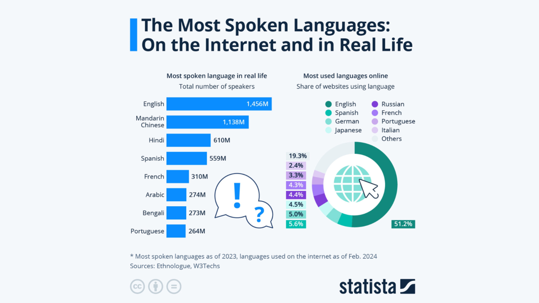
It follows from this that localizing your app into several major languages will easily allow us to reach the widest possible part of the target audience.
Now we can move from language issues to the visual component. The brain loves images and responds to visuals faster and more deeply than to text. That is why, during localization, we will adapt not only the name and texts of the application page, but also carry out visual optimization. Icons, images, colors, complexity or simplicity of screenshots - everything depends on the region of our target audience.
Cultural difference in the perception of visual elements
Differences in cultural and social perception of visual elements can present us with surprises where we would not expect them at all. And now we are not talking about color schemes or symbols, but even about the visual design of metadata - emoji. They even tried to call them an international universal language, but are they so unambiguous?
Emoji and their meaning in different geos

- 👍 Thumbs up - a standard gesture for Western and European cultures, meaning approval, in Eastern culture it has an indecent and even vulgar context, which completely changes its universality.
- The 😇 angel emoji in Chinese culture can be interpreted as a symbol of death and even threat.
- 👏 The applause emoji in Western culture has a meaning that is completely understandable to us, but again in Chinese culture it will be used for a completely different meaning, where this gesture has an exclusively sexual context.
- It’s impossible not to mention a simple and understandable gesture 👌. In Greece, Spain and Turkey it is quite offensive, and recently in the USA it is better to refrain from such gestures.
Differences in the expression of emotions in different cultures and traditional values can lead to such puns, not always in a positive way. Asian culture most often conveys emotions through the eyes, while Western culture most often conveys emotions through a smile.
Taking all this into account, it is now difficult to call emoji a universal language (what Esperanto failed to achieve, these funny emotional icons also failed). But the simple and correct use of emoji, taking into account their cultural context, can be a great help in international communication and the internationalization of our app in different regions.
P.S. Perhaps Google Play's restrictive policies on the use of emoji in visual elements did not arise out of nowhere.
Color schemes and solutions for different countries

- Niche. The theme of the app will largely determine the color scheme of the visual elements.
- Fashion trends. There may be a certain color etiquette, trends identified by successful competitors, or a design style in general. Everyone remembers how suddenly 3D design became very popular or, on the contrary, preferences were in flat trends, both in the UI and then in the product page.
- Specifics of color symbolism and cultural differences. The choice of color, as we have already written, will largely be determined by the category of the application; there are certain color characteristics for applications for sleep, meditation, mental health, or fitness applications. But colors have certain cultural characteristics in different countries.
It is good practice to take all of the above into account when choosing a color scheme for your application and its page. Adapting the product page to the country of display can be a good help, or, initially, when choosing the interface color and design in the store, think about the upcoming distribution of the application in different countries.
Some information to broaden your horizons:
Red in Western countries evokes emotions, it is associated with love and danger, and with green it becomes a symbol of Christmas. In India, red symbolizes purity, in Latin America - religion, and in China - good luck and happiness.
Blue in Western cultures signifies trust and security, often used by banks and police. In Eastern cultures it is associated with spirituality, and in Hinduism with Krishna. In Latin America, blue is associated with religion and mourning.
Green is associated with nature and luck in Western countries, but in Indonesia and China it has negative associations. In Mexico it symbolizes patriotism, and in South America it symbolizes death. Green is also associated with Islam and is used in national flags.
Orange in Western countries is associated with fall and warmth, in the Middle East - with mourning. In eastern countries it symbolizes happiness and health, in India it is considered sacred, and in Japan it symbolizes love and courage.
What else might we encounter?
Our desire to be clear and accessible to everyone may encounter a number of difficulties, but they are all surmountable:
- Cultural differences
As we mentioned above, even innocent emoji can cause disagreements in interpretation, but by studying the markets we are targeting a little more carefully, this can be easily avoided. We also take into account the fact that we can simply not use dubious symbols, with an ambiguous meaning, or on the contrary, use these symbols in a special cultural context to emphasize the connection with users.
- Product for everyone
In addition to visual design and special characters, what we must take into account are: the difference in languages (from right to left or vice versa), date format - what comes first there: day, month or year? And of course, don’t forget about the time format (there are 24 hours in a day, but their display may be different).
- Don’t lose the brand and its style amid localization
This can probably be called the most difficult, since creating a completely universal and at the same time global product is a rather difficult task. But balancing our values, brand characteristics and cultural characteristics of the regions is our goal as a result of this entire process.
Brief conclusions
Localization is difficult, it requires research and time, but at the same time it:
- user trust
- adaptation
- strengthening ties
- increasing visibility for the user audience
- UX improvement
We have already paid some attention to the issues of mobile app localization in the previous article. But I would like to talk about how you can simplify your first steps on the path to world domination of our application.
Localization of mobile apps - tools
We are thinking about translating and localizing our app. For a developer, this would mean that app translation is about adapting the message to users, while localization is about adapting the user experience. But in the community of ASO specialists, it is customary to also highlight app localization from an optimization point of view, and since we are turning to them more, it is worth considering such concepts as localization of the app page, its visual components and app accessibility.
In our strategy for distributing the application to other countries, we will not deviate from accepted practice - look at our competitors. We did this when choosing color schemes for product page design, when researching niche trends, etc. You can easily and simply see what is happening with the visual elements of a particular category using mobile analytics tools:
Visual comparison from ASOMobile
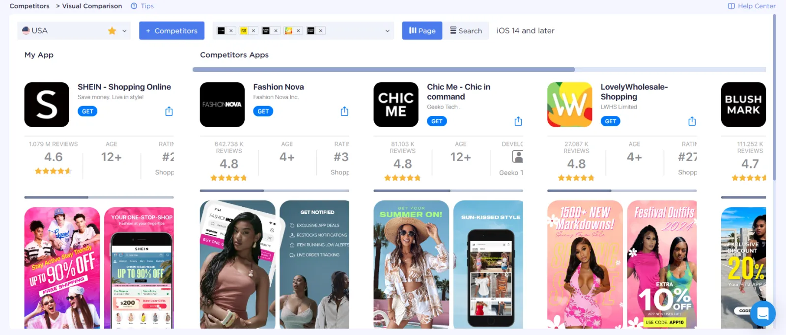
This is what the niche of online shopping apps looks like - an abundance of black colors in the icon. Which for the US market is a reference to luxury life.
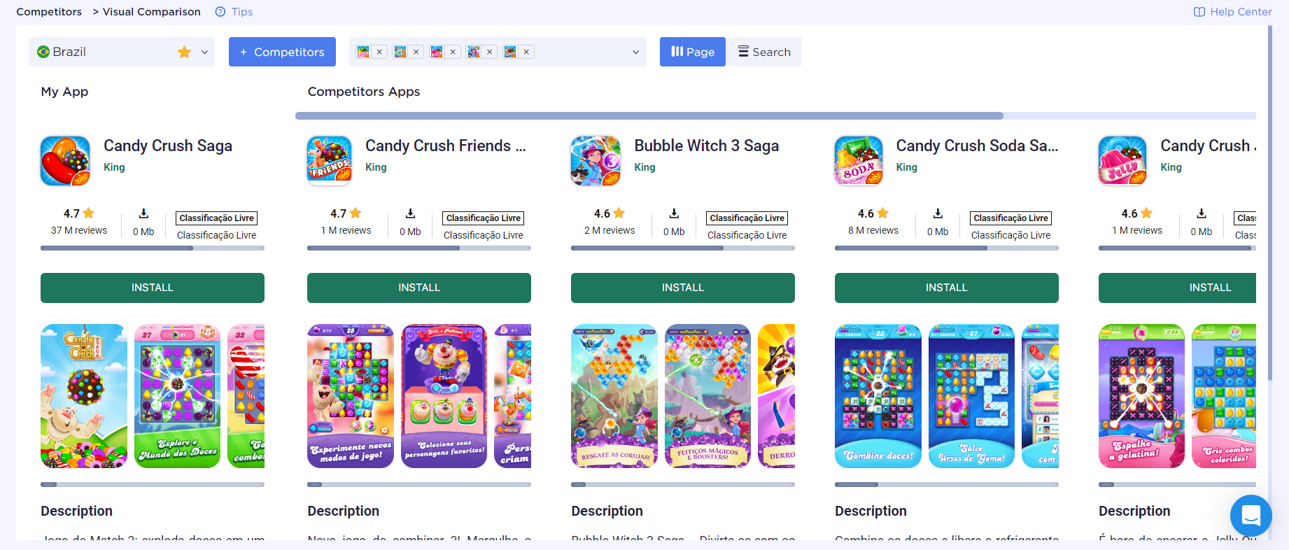
The niche of puzzle games, such as match 3, requires minimal visual solutions, since the main component will be familiar gameplay.
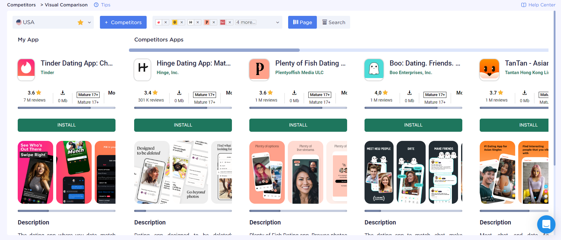
The niche of dating apps is the use of photos, a unified approach to design.
So, we’ve figured out the general trends, now you can pay attention to competitors’ approaches to localization - which countries are being made available and how this is reflected on the product page.
Geo Checker to check app availability
Geo Checker is a great opportunity to look at the strategy of our competitors and assess their availability around the world.
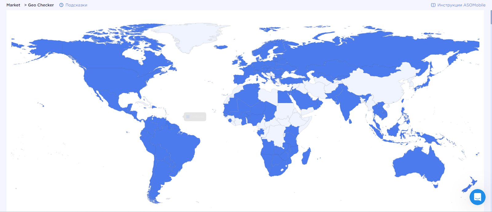
This way we can outline steps for the subsequent localization of mobile apps. Not to mention the opportunity to discover countries where our competitors do not yet exist.
The success of our app in the global market depends on how effectively we adapt it to different regions. Localization is not just a translation, but a full adaptation of content, visual elements and promotion strategies, taking into account the cultural and social characteristics of users. Glocalization, which combines the principles of globalization and localization, helps us maintain the core concept of the product while respecting local preferences.