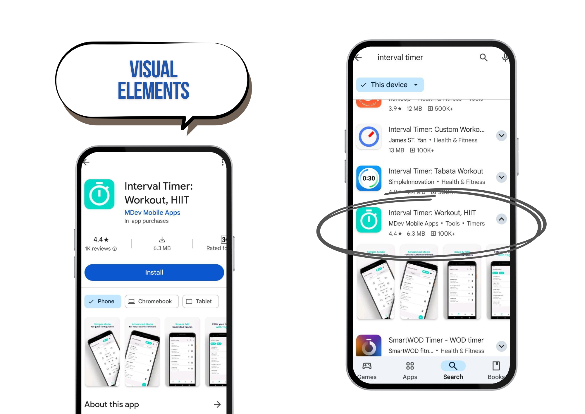
Visual Optimization of Apps
Visual optimization of apps involves the rules for creating and A/B testing the visual elements of your app (icon, screenshots, video).
These elements play a crucial role in influencing a user’s decision to download an app.
Visual Optimization – Basics of Working with Visual Elements
The main visual elements on an app page are:
- Icon
- Screenshots
- Video
- Additional graphics (featuring, in-app purchases)

Icon
The icon is a key visual element displayed in search results and on the app page, representing a miniature of the app’s theme, functionality, or brand.
An icon is not the same as a logo, although it can be one. A logo represents the brand’s values and goals symbolically. Sometimes, an icon may include brand elements or consist entirely of the logo. However, these two concepts should not be confused.
Top Tips for Developing an App Icon:
- Keep it simple and clear.
- Stick to your brand’s color scheme.
- Remember, the icon is not the same as a logo.
- Add borders to the design.
- Consider both dark and light phone themes.
- Don’t use text – save words for text optimization.
- Check trends within your niche.
- A/B testing is essential!
- Adapt to seasons and holidays.
- Two main strategies: either resemble competitors closely or be entirely unique.
- Ensure the icon looks great at any scale.
- Don’t forget to update it.
- Follow platform guidelines.
Screenshots
Screenshots show the app’s key features and are placed on the app page to demonstrate its benefits, helping increase conversions.
There are two main types of screenshots: horizontal and vertical.
- Vertical screenshots are more informative, giving users a quick overview of the app’s features without extra effort.
- Horizontal screenshots are typically used for games, offering detailed insights into gameplay.
Tips for Optimizing App Screenshots:
- The design of screenshots depends heavily on the app category.
- Well-known brands often use very "simple" visual optimization.
- There are specific trends in the visual design for different categories of apps and games.
- Always use A/B testing to finalize the visual design.
Visual Optimization and A/B Testing for Apps
A/B testing is a method to test different versions of app elements in a real environment to see which version performs better and use that one in the long term. Marketing and optimization experts often recommend conducting A/B tests. This is a crucial part of ASO because visual elements directly affect conversion rates (app installs).
A/B testing helps determine which elements attract more users. You can test:
- Text fields
- Icons
- Screenshots
- Promo videos
A/B testing for ASO compares different versions of elements on the app page (e.g., icon or screenshots) to determine which is more effective at attracting users. All visitors who land on your app page participate in these tests.
Additional Resources:
- How to Optimize Your Icon to Increase App Conversions
- Screenshots for App Store and Google Play in 2025: A Complete Guide to Increasing Conversion
- Visual Optimization – Scenarios and Technical Requirements for Designers
How to manage ratings and reviews. How to make your app featured. Move on to the next lesson.
Explore competitors' visual elements using ASOMobile – try it for free.
