ASO for Indie Developers. Performance evaluation. Part 3
We continue our series of publications dedicated to ASO for Indie developers. In the first part, we figured out how to collect and analyze the semantic core for our game. In the second part, we generated metadata and prepared it for release on the market or store.
And in our third part of the series of articles about ASO for Indie developers, we will talk about the final stage - we will touch on visual optimization, performance assessment, and how to further build work with our game so that it does not take a lot of time, but does not miss anything.
Visual ASO for Indie Developers
Visual elements are the key to installation, and in the mobile industry, there is a rule of “three seconds”, which is how much time we have to attract a user to our page from the search results, and how much time they will spend studying the game page itself. The icon is our guide to the product page. It appears in the search results list, correlates with the game's name, and is relevant to the search query.
Imagine search results for the query match 3 games:
It is evident that the search results on the App Store and Google Play differ significantly. When discussing the Android platform, icons are the primary focus; they are the ones that should direct the user to our game's page. However, the App Store allows for imagination, and it's not just icons that come into play; the search results are filled with screenshots of games and apps. On Google Play, we can also view screenshots without visiting the app page; instead, we can open its preview directly when searching. All this leads to one important idea: users will go to the page only if we are able to hook them and interest them.
Icons and ASO
If you look at the trends of the most downloaded games of the two stores for 2023, you can identify certain patterns and use them in your visual optimization:
- Icons contain a game character or several game characters.
- Icons that demonstrate part of the gameplay convey the essence of the game.
- Most icons have a lot of colors, but there are also very simple and monochrome solutions.
- Low presence of text on icons. Typically, games with a high degree of recognition can afford it. Indeed, in mobile search results, the text of the game name on the icon is practically indistinguishable; fame and brand play a role here.
As for the approach, ASO for the App Store and Google Play cannot be the same; we will also actively use it in visual design. And also not forgetting about the localization of the page and the game itself. Examples include the game Roblox, which has a different icon on different app stores, which once again confirms the theory about the different tastes of the user audience - they construct search queries differently and react to visual elements. Among Us features excellent localization, taking into account the peculiarities of the Asian market. For Japan, the icon has a distinctive look, even within the App Store.
Screenshots and ASO
Screenshots in games are a key factor for most users when deciding whether to install. That is why, when creating these visual elements, we will try to keep in mind the following points:
- Screenshots should not only be attractively designed, but also fulfill a functional task - to introduce our future users to the gameplay.
- We don’t just take screenshots of the game’s internal content; we guide users through a logical narrative and plot.
- Another way to attract user attention can be through artistic design of the interface, when screenshots are replaced with rendered images.
- Screenshots can feature the main character or characters, which will be drawn outside the gameplay, drawing attention and creating the illusion of interaction with the character.
An example of the story and plotline of the game, without explicit gameplay, without focal inscriptions and appeals to users. Screenshots are horizontal.
An example of vertical screenshots, with a list of game locations, and a call to action.
Another example of screenshot design, with an emphasis on the main characters. It's quite interesting that in the previous two paragraphs, horizontal or vertical screenshots were determined by the gameplay itself, but here you can see the decision to arrange the screenshots horizontally, while displaying the vertical layout of the gameplay.
Games need screenshots that impress potential users with context about how fun the gameplay is, as well as high-quality visual design. But there are niches of games where everything looks completely opposite - no artistic design, appeal to users, etc.
Brief conclusions on the design of screenshots:
- It's essential to have screenshots that are concise, uncluttered, and scalable, as users will view content on a range of devices, including PCs, laptops, smartphones, and tablets.
- When using a call to action, remember that the text should be light and used to frame the visuals, not instead of them.
- The logic and hierarchy of screenshot placement should follow the gameplay and core functionality. We strive to present our best side in the initial screenshots.
- We do not contradict our own UI and UX - we do not deceive or mislead users by distinguishing between what is shown in the game page screenshots and their actual contents.
- We research competitors because the tendencies and trends of the niche and category of our game can be very different. To this end, it's worth taking a look at Visual Comparison by ASOMobile. And all the competitors we relied on when collecting semantics and generating metadata are in the palm of our hands:
Mobile games can utilize the opportunity to stand out by frequently updating their icons in unique and creative ways.
Seasonal icon updates and A/B testing of our game's visual assets are effective strategies for evaluating the impact of our creative components. We study icons and screenshots of competitors, determine the popular colors and styles of icons in our category, and analyze how often competitors update their creatives.
Benchmarking against competitors is critical not only to our offering but also to maintaining design consistency. A certain design or color palette appeals more to users in certain categories. Therefore, we must take this into account in our visual optimization strategy.
Assessing the effectiveness of ASO
The work done can be assessed not only by the level of installations of our game, although, of course, this can be called the quintessence of all our efforts. But if a sharp jump in installations did not occur, or if everything was good, but became not so good, an assessment of what is happening is necessary at almost all stages of the game’s life cycle.
You can do this in one click and get the most complete picture possible using the ASO Dashboard tool:
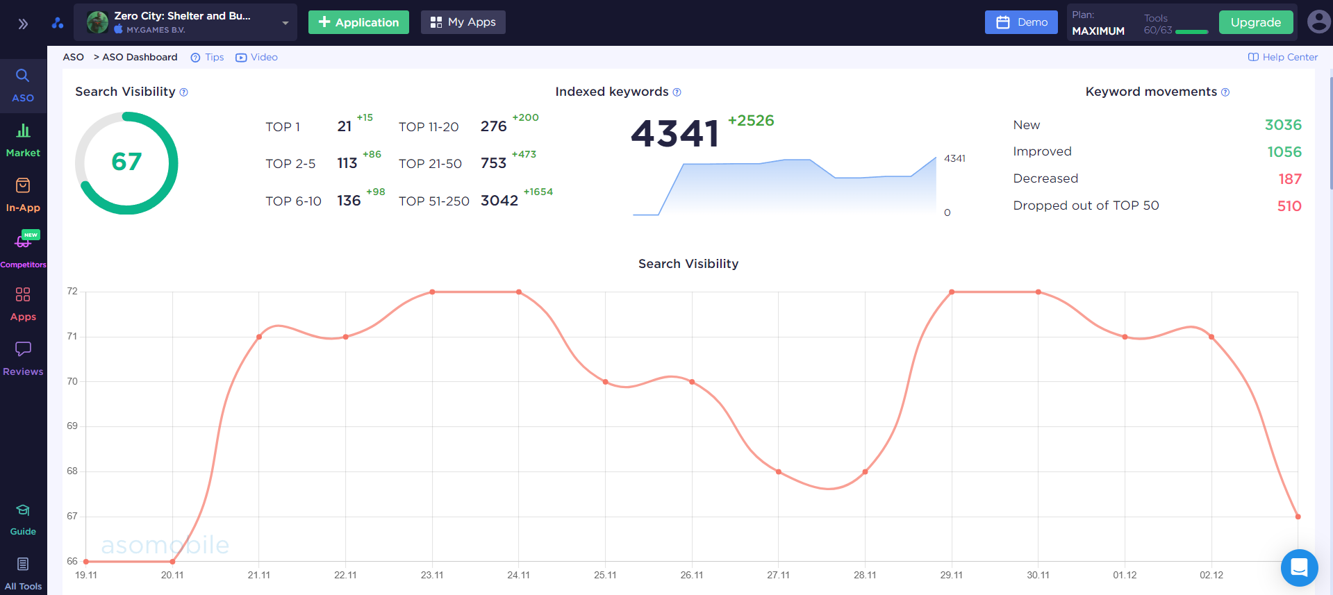
Here we have the opportunity to monitor the performance of our game for any period. We will pay special attention to the dynamics of indexed key queries, especially in the moments immediately following their release. The App Store will index our new metadata, and we can already see an increase in indexing within the first or second day. After a couple of weeks, you can already look at the visibility indicator in search and look at its dynamics; it is typical for iOS apps to receive some boost in keywords after release, and those keywords that we remove from the metadata (if this is not the first iteration) are forgotten by the store .
In addition to indexing, it is worth considering the distribution of indexed keywords from our semantic core:

The more requests fall into the green zone—the top 10—the greater the likelihood of installing our game. But we’ll see what keywords are used to get installations in the following infographic:
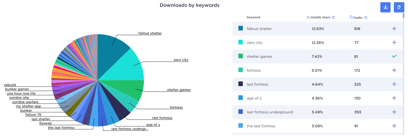
This way, we can conduct a check-up on the optimization state of our game, in any geographic location and on any date.
Working with ratings and reviews
In addition to influencing ranking algorithms, ratings and reviews can be a significant factor in determining whether our game is installed or not. If we do not work with this factor, then we cancel out all efforts on text and visual optimization.
What does the assessment tell us? The rating of a game affects its placement in search results, its ability to be added to favorites, and the user’s decision to download - 79% of users rely on ratings and reviews before installing.
- Ratings of 5 and 4 do not negatively impact the download decision.
- A rating of 3 and below will reduce the number of applicants by half.
It is essential to recognize the following trend: app stores, like us, are also interested in installations; therefore, user ratings are crucial for their algorithms. However, on the other hand, both in ratings and reviews, the principle of the silent majority can be effective - when users are satisfied with everything, they will not evaluate our game on its merits. The rating formed for the store is based on the feedback from those users who took the effort to leave it. So the motivation of users to leave a rating rests entirely on our shoulders. We can read how to work with ratings and in-app notifications here. But analytics also gives us a wide range of tools:
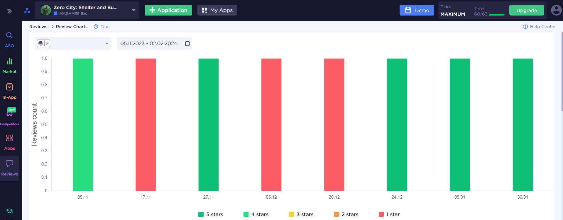
- Ratings and reviews: get a complete picture of what is happening with ratings and reviews.
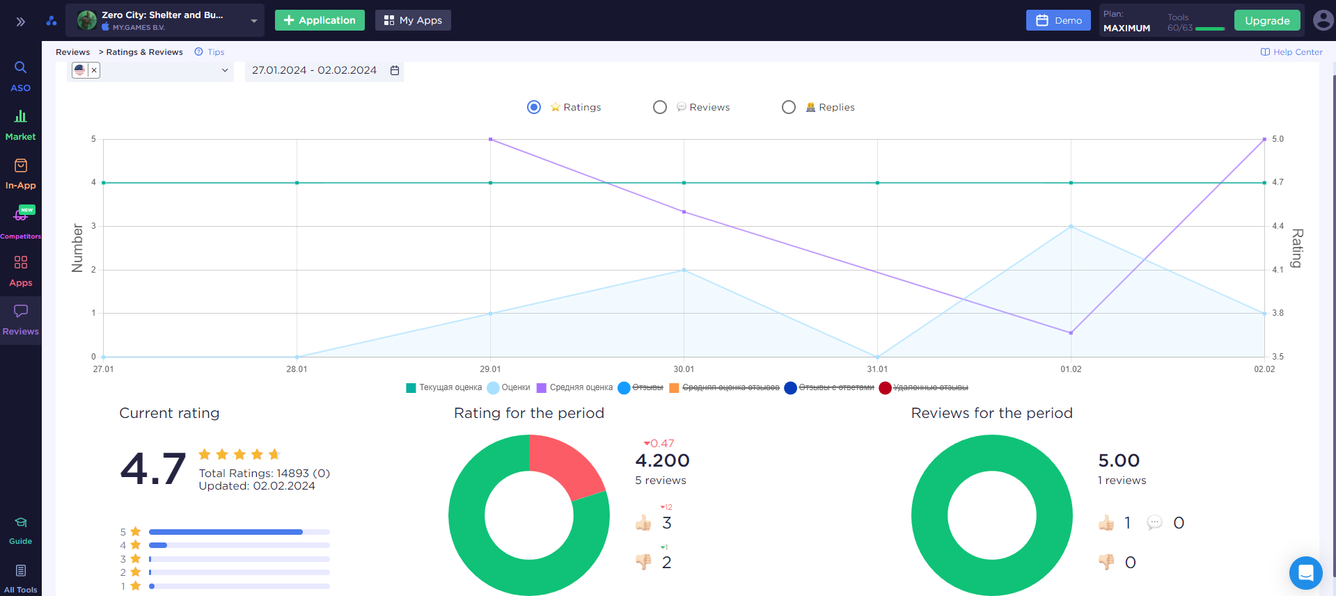
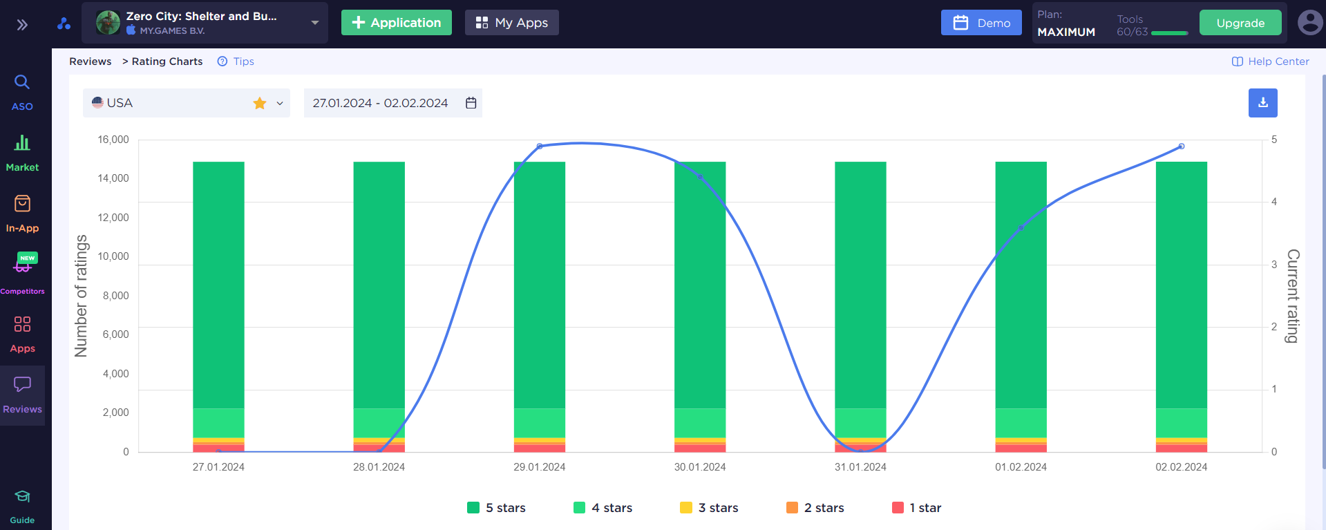
- Rating Charts: dynamics of ratings in the country and for a certain period.
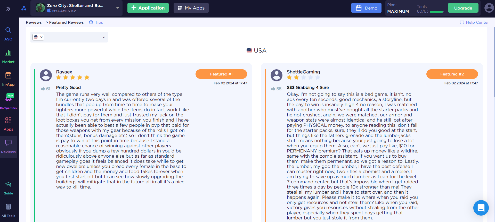
Featured reviews are the most important reviews because they are visible on our game page. And if there is a negative user experience, and even an unanswered one, I think it will definitely not add points to us. What follows from this is that working with reviews and user experience is another task that requires attention and effort.
This is why the next point can be so important - how to respond to reviews?
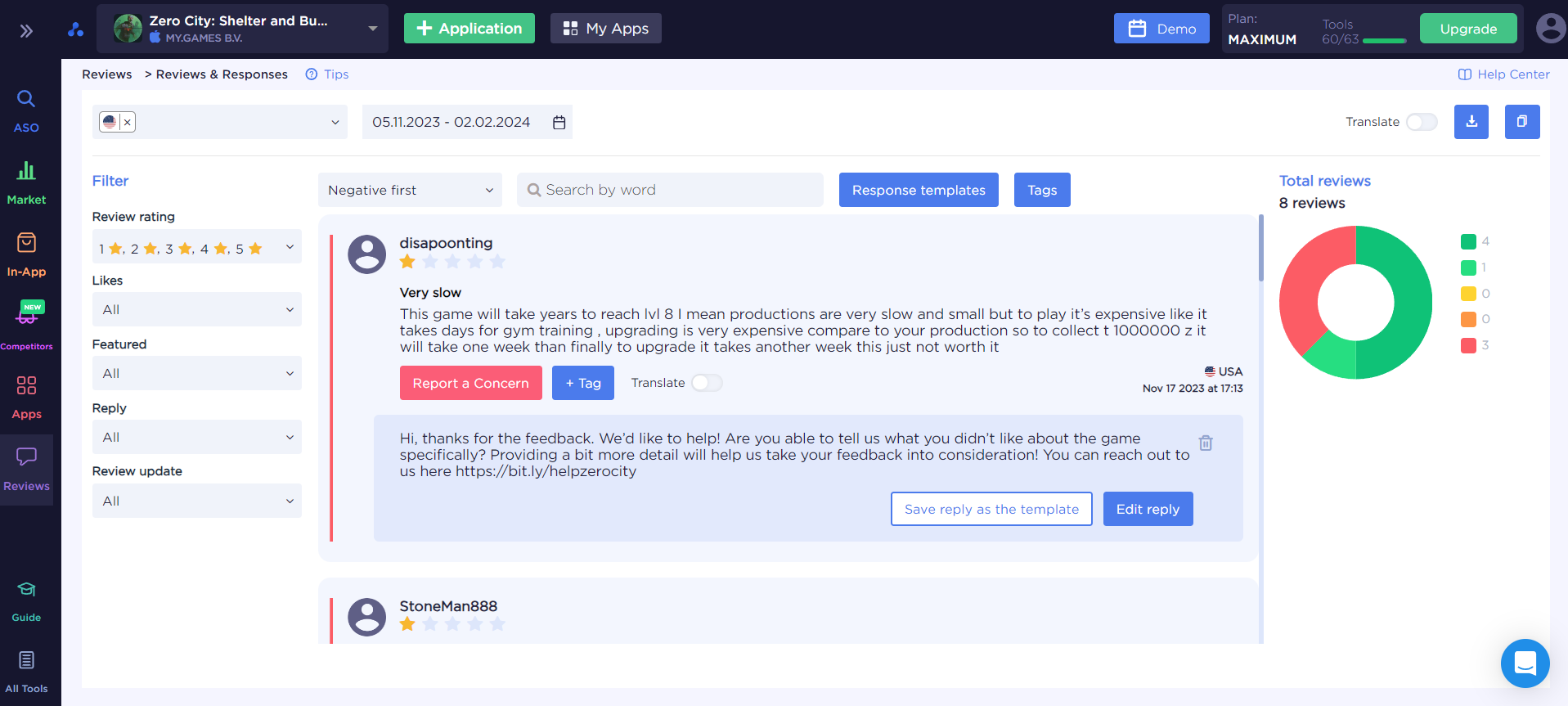
A tool that will allow you not only not to lose sight of reviews, but to work with both negative and positive reviews. The latter should also not be ignored. Responding to reviews is an essential part of engaging with our target audience.
- Response templates - a tool that will allow us to download response templates in advance and use them when working with feedback. Convenient and fast, especially when it comes to positive reviews (several standardized responses thanking users make life much easier).
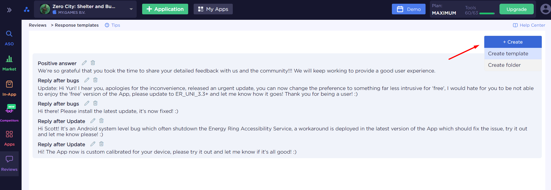
It is better to address negative reviews in a personalized manner, as we acknowledge the problematic aspects of our game and thank users for their comments and the opportunity to improve.
Briefly about the importance of working with reviews:
- Possibility of user feedback - we will learn about problems with the game or app that were missed during testing.
- An opportunity to demonstrate that we are continually working on our game, staying in touch, and listening to our users.
- Reviews as an opportunity for additional indexing. This is particularly true for Google Play, as it is there that we can include the necessary keywords in our responses to reviews. Additionally, users help us by using relevant search phrases in their comments.
- A negative review and rating is an unpleasant situation, but it is much worse when there is no response from the developer to this review. This demonstrates our indifference to the audience. But responding to a negative review, correcting its cause, and it is quite possible that the user will change his opinion to a positive one - this will be reflected in both the rating and the review.
Let's summarize ASO for Indie developers
We hope that this series of articles, with a detailed analysis of the stages and tools of ASO for games, will become a useful source of information. We went through all the steps, from collecting and analyzing the semantic core, generating metadata, visual optimization, working with reviews and ratings, and analyzing the results of the work done. You should definitely not expect the optimization work to end there. If we want to keep our game at the top of search results, then analyzing semantics, competitors, and the market should become our routine. However, the most labor-intensive part is the initial optimization for the game release. But it will become easier and more effective with our guides and ASOMobile analytics.
