App Store Product Page Mistakes
Today, let's talk about mistakes leading to worse App Store product page conversion rates. If you look at it, ASO rules for iOS applications are much more straightforward and more transparent than for Google Play, but still, we will go over the main shortcomings of the app page, which reduce the app visibility in search results or do not sufficiently disclose all the necessary information for the user, thereby it just goes away without the desired result - installation.
We wrote a lot about the rules of ASO optimization on the App Store and gave practical cases. Today, we will examine the app page and decide what is wrong and how to fix it.
Different elements of the app page perform different functions and are filled in different ways: from textual metadata to visual elements, everything paints a single picture, which we call the app page on the store. It is according to it, as we know - judged by the cover that users will decide to install it. So we don’t have many opportunities, channels, and space to tell him about our capabilities and functions, to interest him, and generally organize a meeting with our application.
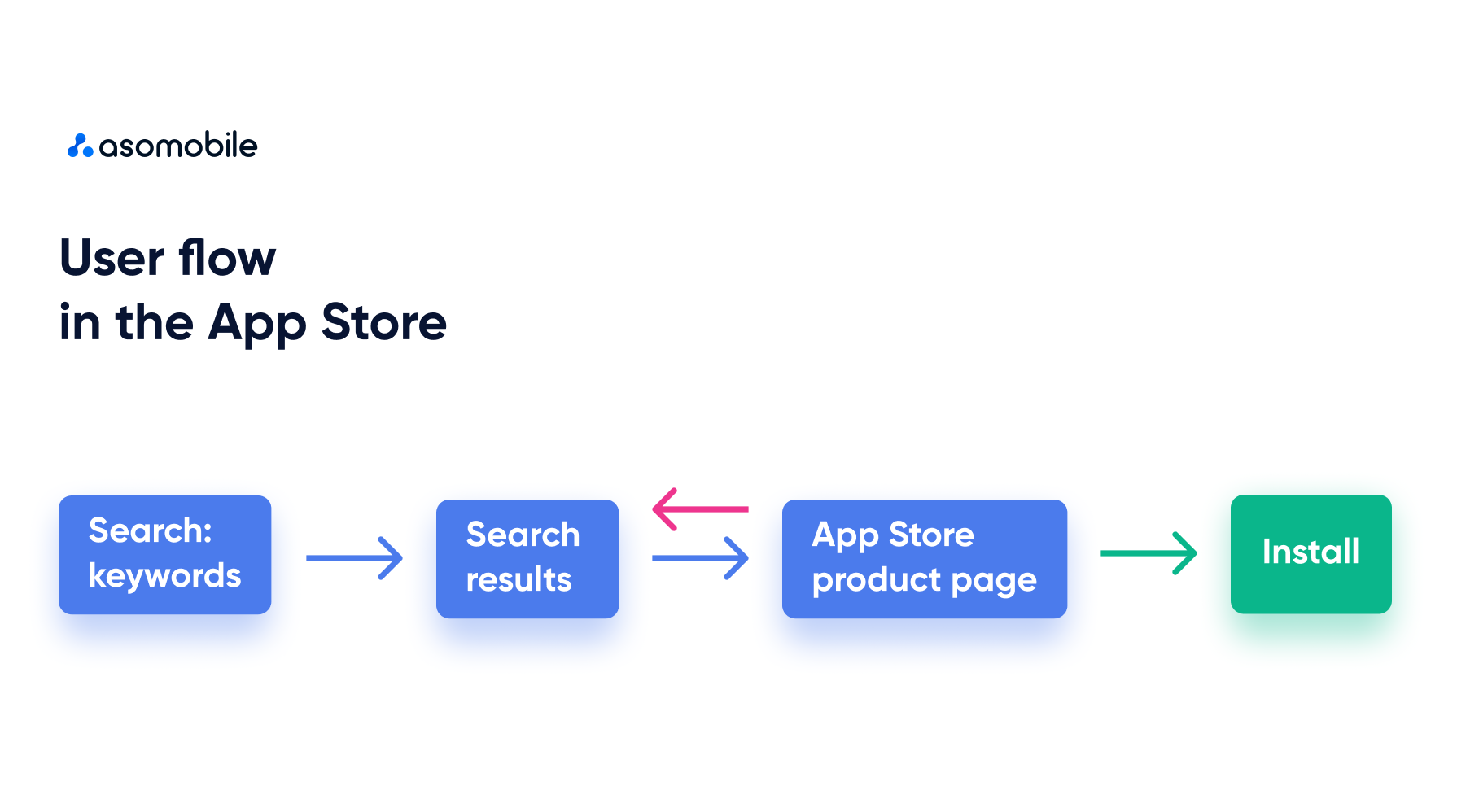
The user’s path from search results to the application page is very short, and this page must convince him that we meet their expectations. Based on the infographic, the user can end up on the application page with the installation or return to the search results again to search for a more relevant offer.
Let's look at how errors and inaccuracies in working with the app page affect each stage of the user journey. They should be divided into two large groups - errors that reduce the visibility of applications and those that directly affect conversion.
Product Page Mistakes that affect the visibility of the application.
Returning to our infographic, a very important thing happens at the moment of search query - search results: applications that are indexed by the search query will be shown in search results. Without indexing, the user will not even be able to encounter our application, let alone go to the app page and install it. In addition, here comes the concept of our application's position in the search results. The user will not scroll down the search results, so the higher the position, the higher the chance of being discovered.
Almost everything we mentioned is related to the text part of application optimization, so this is what leads to these problems:
- The title is too short - we miss the opportunity to be indexed for relevant search queries.
This remark applies to everyone except brands (and, let’s be clear, well-known brands). If we are Twitter (X), we do not need to tell users anything else. Brand loyalty is very strong, and when searching for Instagram, it is unlikely that we will be able to captivate users with something else.
- The absence or incompleteness of the subtitle will lead to similar problems as point 1.
- Using irrelevant or ineffective keywords - users don’t search that way, and such search queries are useless.
- Repeated keywords in metadata are a waste of characters; even without being able to parse the keyword field, we can encounter this kind of omission in the visible title and subtitle fields.
- Lack of additional locales for the application. Cross-localization is a great way to increase the indexing of your application. Ignoring this leads to a small number of keywords for which the application can appear in search results.
- App Rating - A poor rating also reduces the app's visibility in search results. The store is not interested in applications that are of low quality and are not liked by users.
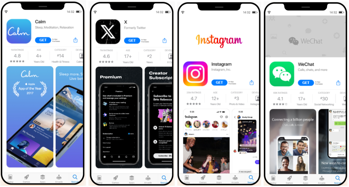
Examples of errors on the application page:
The first two examples show an empty or insufficiently filled subtitle - plus 30 characters to the ability to be indexed. The third example demonstrates a bet on the brand, using only it in the title - time will tell whether it will work. You can also include incorrect visual design of screenshots, but more on that a little later. In the last screenshot, we see the duplication of keywords in title and subtitle - expense(s).
Product Page Mistakes that reduce conversion.
When it comes to conversion, visual elements play a role in this. It also calls to the user on the application page, but let's talk about everything in order.
- Icon - the application icon will interact with the user, from search results to the device's screen on which the application is installed. An icon that is dissonant with the functionality of the application (not an association between the app’s task and its icon); an icon that does not provide a unified picture with other visual elements; an icon that is too filled with small details, making it unclear - all this leads to lower conversions. The user's path may end at the search engine results stage and on the app page.
- Screenshots are screenshots that need to be provided with focus captions and appeals to the user. Screenshots are a demo version for our users, who can see the interface and main functionality without installation. The design of screenshots is often filled with various errors - overload with details and information, challenging to read CTA texts (font, contrast, etc.).
- Lack of a unified approach in visual design - correlation between the icon, screenshots, niche, and fashion trends. All this can either attract the user’s attention or work the other way if the approach is incorrect. This can also include the low quality of visual creatives - when the quality of the images leaves much to be desired or the decision about visual elements was ill-conceived.
- Reviews are a direct channel of communication with existing users. But we must remember that this is a great way to see the application from the outside. Without installation, our future users will see the whole picture - ratings and reviews. A large number of negative reviews will indicate quality, and a large number of unanswered reviews will indicate the attention of the developers to this project.
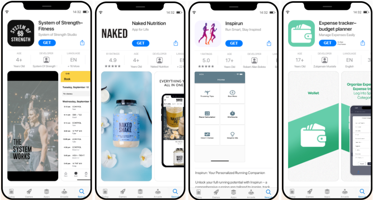
Example of visual design errors:
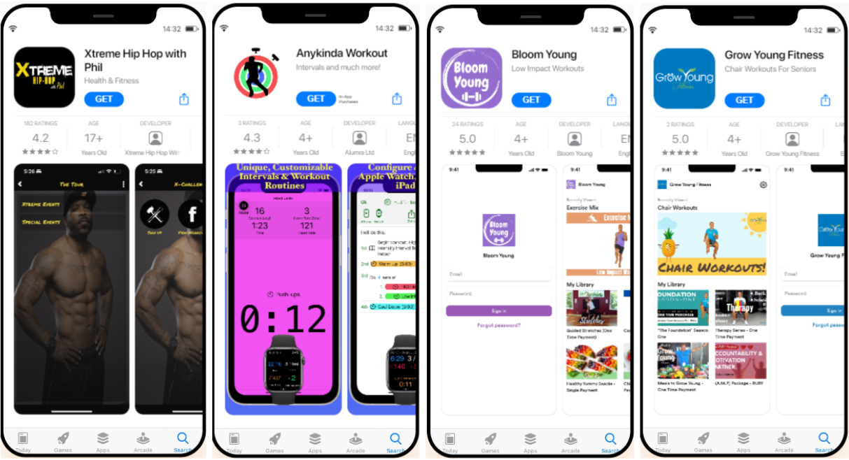
Example 1 - A full icon does not make it possible to understand the application: there is a lot of text and few visual symbols (and we know that the brain reads a picture faster than text).
Example 2 - there is no uniform style for icons and screenshots. Focus inscriptions are lost against the background of functionality.
Example 3 - there is no artistic design of the screenshots or focal inscriptions. The order of the functional screenshots is chosen incorrectly; the first one is the authorization snapshot, which is not entirely of interest to the user.
Example 4 - the text on the icon is practically invisible. There is no design of screenshots accompanying them with focus inscriptions.
How to avoid mistakes in the design of an app page on the App Store?
When discussing text optimization, the main rule is to use all available characters. You can quickly check your metadata in the ASOMobile analytics tool - ASOCreator.
- for a title, 30 characters is not much, but it’s certainly better than just writing the name of our application without explaining anything to the user and the store (as we have already seen, this only works if the application’s recognition is very high.
- subtitle 30 characters will allow us to introduce the user to the application's main functionality and let the store know which key queries are relevant to us. It does not repeat words already in the title; we use space sparingly in the metadata text fields.
- We use keywords and localization in full and according to the rules, filling 100 out of 100 available characters without repeating the keywords that have already been used above. And additional locales will be a great help for expanding our indexing.
- We monitor the rating of our application, which is equally crucial for both users and the store.
Visual elements are the most essential part of an application page. If we know that our page was viewed 1000 times, but only 10 were installed, then there is a failure in the user journey, and we need to pay attention to the screenshots and the application icon:
- We develop a unified design concept and do not allow dissonance in the interface, screenshots, and icons (style of elements, fonts, color schemes).
- focus inscriptions - noticeable enough to attract attention but also go well with the screenshots themselves.
- we follow the rules of the application store and design the icons and screenshots correctly.
Such a simple guide will provide our application with good visibility in search results and increase our chances of installation after users visit the application page.