App Icon: Trends and Best Practices 2025
An app icon is more than just an image. It’s our permanent visual ambassador on the user’s smartphone. While screenshots and descriptions are visible only in the app store, the app icon stays with the user everywhere — on the home screen, in search, and in the notification list.
In search results, it’s our brightest signal to the user — and given the common “3-second rule,” it’s our main weapon to grab attention before they scroll past.
But its role doesn’t end after installation. Every time a user searches for an app on iPhone or Android, they rely primarily on a familiar visual. Our app icon serves as a brand business card — it must be recognizable, clear, and evoke the right associations.
Years of practice and A/B testing data have proven that a well-designed app icon can increase conversion by dozens of percentage points. But in 2025, a beautiful image alone isn’t enough. A strategic approach is required — one that considers design trends, platform requirements, and the psychology of perception.
This guide explains how to create an app icon that doesn’t just look good, but works for our success 24/7, from the first glance in search results to daily use.
Core Design Principles for 2025
The app icon is the app’s face and the main navigation cue for users. In 2025, a successful app icon is built on four key principles:
Minimalism That Speaks Louder Than Words
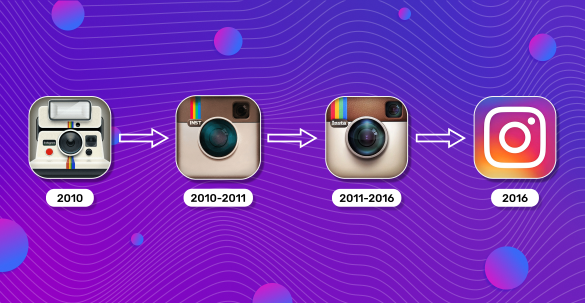
A modern app icon must remain legible even at the smallest size. We abandon complex details in favor of one dominant element. That’s exactly what Instagram did: evolving from a detailed camera with a rainbow to a simplified symbol, and then to absolute minimalism while retaining its signature gradient. Each step of this evolution proves: the simpler, the more memorable.
Meaning Comes First
The user should understand at first glance what our app represents. The iOS app icon for a financial service shouldn’t look like a game, and a messenger shouldn’t resemble a photo editor. Our icon must instantly convey the essence of the product.
Trends 2024–2025:
According to the latest trends, app icon design is dominated by minimalism, with soft shadows and gradients used to create depth. The focus has shifted to a single key element rather than complex compositions.

Cross-Platform Adaptation:
Our app icon must remain recognizable across both the App Store and Google Play. We need to ensure it looks good on different backgrounds and in various sizes. A successful icon works everywhere — while still respecting each platform’s specific rules.
These principles aren’t just trends — they’re proven tools for increasing conversion, boosting recognition, and building user trust every day.
Technical Requirements by Platform
Creating the perfect app icon is like preparing documents for two different countries — each has its own laws and standards. By 2025, Apple and Google’s technical requirements will have become even more specific.
Technical requirements:
| Parameter | App Store (iOS) | Google Play (Android) |
| Size | 1024×1024 px | 512×512 px |
| Format | PNG | PNG (32-bit) |
| File size | No strict limit | Up to 1024 KB |
App Store:
iOS icons follow strict standards. Don’t add your own rounded corners, shadows, or gloss — the system automatically applies Apple’s signature mask. The icon must be a square PNG without transparency and uploaded to the project’s Asset Catalog; otherwise, the app won’t pass review. A/B testing can be done via Product Page Optimization, which allows comparing up to three icons — all must be included in the build as alternate icons through Xcode 13+.
Google Play:
Google Play uses a different approach. Instead of a single flat image, we prepare a “construction kit” — separate layers for the foreground and background that the system combines automatically. According to Android Developers, this allows icons to adapt to different shapes and themes set by users. Upload a square asset without rounded corners or outer shadows — the platform adds its own 20% radius mask and shadow. A/B testing via Store Listing Experiments allows testing icons with real traffic — ideally, one asset should be tested for at least a week.
Both platforms forbid artificial badges (“Top,” “Sale,” “5★”), text labels, or ratings — all of which cause the app to be rejected during moderation.
Apple and Google’s technical standards differ significantly, and following them precisely affects whether your app gets noticed. Allocate enough time for adaptation — it’s a truly crucial step.
Design Patterns and Anti-Patterns
Successful app icons are usually built around a clear silhouette — one that remains recognizable even at tiny sizes. Use 2–3 main colors for harmony without clutter. Thoughtfully placed inner shadows and highlights create depth, while platforms add their own external effects.
Visual consistency is just as important — your app icon should be part of a unified style that echoes your screenshots and creates a cohesive app store impression.
On the flip side, we must avoid common mistakes. Tiny details that look great at full size become blurry spots on the home screen. Text on icons not only violates store policies but also becomes illegible when scaled down.
Ultimately, creating an effective app icon is the art of balancing recognizability with simplicity, individuality with platform rules.
Differences Between Game and App Icons
When designing an icon, we must clearly understand its context — not only technical but also market-specific. One of the key questions: who are we designing it for — a utility user or a gamer seeking excitement?
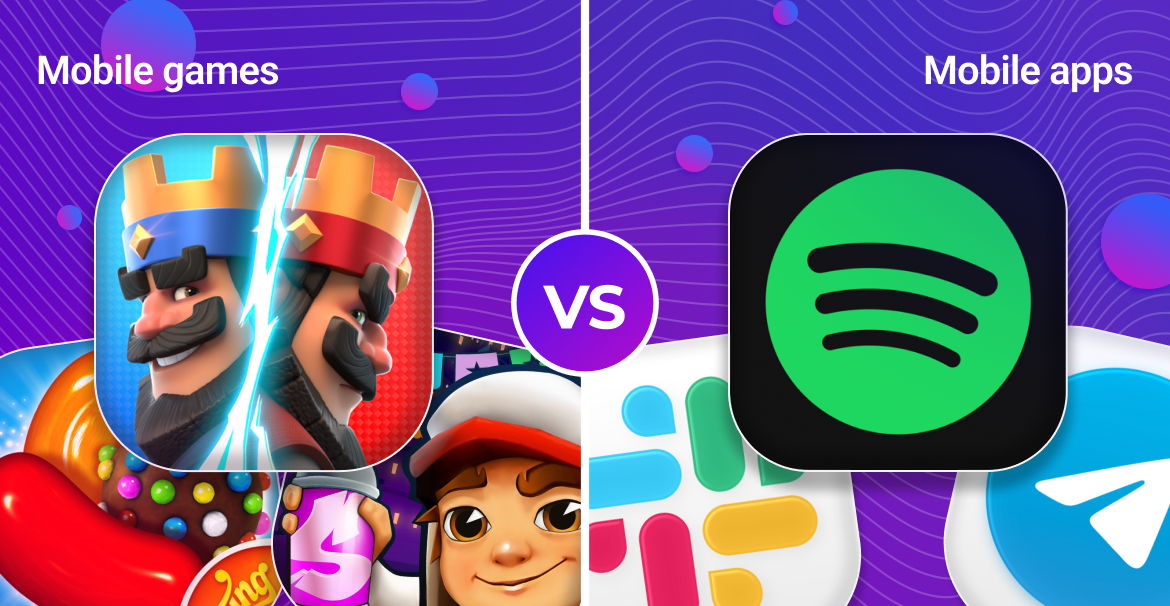
For utility apps, focus on clarity and recognizability. The goal is for users to instantly find the tool on their screen. Use concise symbols, logos, and brand colors. Look at Slack, Telegram, or Spotify — minimalist icons that build long-term brand identity.
Games, however, have a completely different mission: selling emotion and gameplay. The icon acts as a mini-poster meant to spark curiosity. Use vibrant characters, key objects, and dynamic scenes. The success of Candy Crush, Clash Royale, or Subway Surfers shows that recognizable characters and art are powerful attention magnets in crowded game categories.
Different Icons for App Store and Google Play
Upon close inspection, you’ll notice some apps have small yet noticeable icon differences between iOS and Android. This practice not only exists but can be justified. Major companies often A/B test separately on each platform and choose the versions that convert best within each ecosystem. For instance, Facebook has at times used a brighter blue on Android, while keeping a lighter shade on iOS to better match the platform’s visual style.
However, for us, this should be a strategic choice. We can take this path if the test data clearly shows that iOS and Android audiences respond better to different visuals. But we must balance platform optimization with consistent brand identity. Changing icons “just for variety” means voluntarily giving up built brand recognition.
Creation Process from A to Z
Building an effective app icon is a sequential process where each step builds on the previous one. From initial research to final testing, every stage aims to create a visual that drives conversion.
Research Stage:
Before designing, perform detailed market research. Study the top 10 apps in your category: which colors and shapes dominate? Which visual patterns repeat? For side-by-side comparison, use tools like Visual Comparison, which let you place your prototype next to competitors and instantly see how it stands out. It’s not about copying — it’s about understanding your audience’s visual language. Identify two things: the visual “language of the niche” and the “points of differentiation.”
Concept Stage:
Based on research, create 3–5 concept sketches, then select the 2 most promising directions for refinement. Each app icon should work in three dimensions — conveying the product’s essence, standing out among competitors, and remaining legible at a minimal size.
Testing Stage:
Modern tools let us know exactly what works. Use A/B testing through Product Page Optimization (iOS) and Store Listing Experiments (Google Play). Test not just overall perception but individual elements: background color, main object shape, detail level. Each iteration brings us closer to the perfect icon.
This process is like growing a crystal — it starts with a small seed of an idea that gradually gains layers of meaning and validation until it becomes a flawless, multifaceted gem that captures the light of thousands of users’ attention.
Checklists and Common Mistakes
Before releasing your app icon to production, make sure it passes all critical checks. Divide the review into two logical parts: technical compliance and visual performance.
Technical checklist — the foundation without which your icon won’t make it to the stores:
- Google Play icon file size does not exceed 1 MB
- For iOS, the icon is added to the project’s Asset Catalog
- Android adaptive icon layers are correctly configured
- No prohibited elements like badges, text labels, or ratings
Visual checklist — ensures your icon performs its main role: attracting attention.
- The main element is legible even at a minimal size
- The background provides sufficient contrast without clutter
- The icon is recognizable without captions or hints
- The design remains consistent across light and dark themes
Common mistakes to avoid in final checks:
- Overly detailed design that hinders instant recognition
- Using text that becomes unreadable at small sizes
- Ignoring platform effects (automatic masks, shadows)
- Skipping variant testing
- Mismatch between icon style and app theme
This comprehensive review ensures your icon not only meets technical requirements but also effectively attracts your target audience.
Conclusion
An app icon is more than just a design element. It’s our silent salesperson working around the clock. It greets the user in the store, lives on their home screen, and becomes the lasting symbol of our app in their memory.
But most importantly, remember: our icon exists in a dynamic environment. Trends change, algorithms evolve, and users become more discerning. A successful icon today isn’t static — it’s a living asset that must evolve and adapt.
Use A/B testing as a compass in a world of subjective opinions. Trust the data, but don’t forget creativity. Combine proven principles with bold experimentation.
Start applying these principles today — and your app will gain not just a new icon, but a powerful growth tool that works for you.
Optimize easily and achieve success💙
The app icon is the first thing users see in the store and the one element that stays with them on their phone. It works 24/7 — in search, on the home screen, and in notifications. Your icon often determines whether a user opens your app page and recognizes your brand among hundreds of others.
2025 is the year of minimalism and clarity.
Simple yet meaningful design without unnecessary details.
Soft shadows and gradients to create depth.
Focus on a single main element rather than complex compositions.
Cross-platform consistency — the icon should look great on both App Store and Google Play.
App Store (iOS): square icon 1024×1024 px without transparency — Apple automatically applies rounded corners.
Google Play (Android): uses adaptive icons — separate layers for foreground and background; file size limit of 1 MB; no text, badges, or ratings allowed.
Through A/B testing:
iOS: Product Page Optimization in App Store Connect.
Android: Store Listing Experiments in Google Play Console.
Test not only the overall look but also specific elements, such as background color, shape, contrast, and level of detail.