Features of App Store and Google Play user behavior
When developing ASO strategy and app promotion, we will take into account the factor of features of user behavior depending on the store - App Store and Google Play. Behavior patterns are familiar and different - overlooking this would be a severe miscalculation in our development plans.
Currently, iOS has 27.89% of the market for active devices, and Android has 71.44%. That's why we will be looking at the user behavior of these industry giants.
App Store and Google Play are the two biggest application stores. Users download more than 90% of apps through them. These two competitors are constantly competing and trying to take the lead. This eventually pays off: new developer tools and features for users and marketers. But despite all the attempts to be unique and original, constant development still leads to the best solution to problems - unification. It is reasonably expected because the essence of the App Store and Google Play is the same - a platform where the user can find, buy, and download the necessary application or game.
Although the two platforms are very similar, user behavior will be different. The user experiences themselves in different places, which leads to a difference in the behavioral factor. This is why we consider user behavior as one of the stores' differences for ASO specialists.
Factors that influence user behavior
Before counting differences, let's still understand what influences user behavior.
User behavior is driven by their geographic, social, age, professional, and cultural backgrounds. These are all things we encounter when building a portrait of our target audience.
Geography factor
Based on the Splitmetrics report, Google Play users are geographically dominant in Africa, Asia, and South America, with a reasonably strong presence in Europe. North America, on the other hand, with the majority (58.95% of users), belongs to iOS.
The generosity factor
Our annual report shows a stable market picture - Android users install more, but the Apple audience is much more generous in their spending on mobile apps.
UX - user experience
The app pages in stores look different, and the layout of visual and textual elements is different. Pay attention to screenshots: the first thing that catches your eye is the size of the screenshots. The visual aspects of iOS apps are more significant and leave little chance for textual information. They may bet that the brain reads images faster than letters and numbers.
Google Play counts on the fact that the user will not limit himself to viewing screenshots but will look at the brief description and ask about the number of installations.
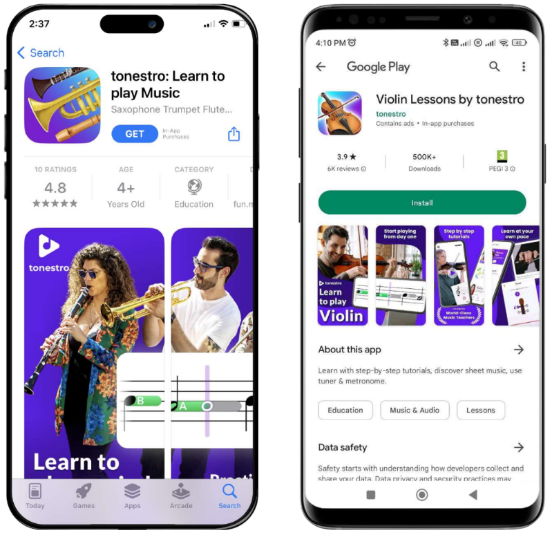
There are two theories here. The first one is that screenshots are among the most significant elements influencing the conversion rate. The second is that the location of the application's visual features is more important than the size of the picture. Both theories have a place to be and are proving successful on the sites, which only emphasizes the difference in user experience.
The nature of app users
When discussing user behavior, you can't ignore their varieties. The mobile industry separates two types of users, "decisive" and "explorers."
"Decisive" users make quick decisions and have minimal interactions with the interface. They enter a page lightning fast; everything scans with their eyes for 3 to 6 seconds before finally deciding. They make up somewhere between 60 and 70 percent of all users. And they never scroll.
"Explorers" users, as you might guess from the name, spend much more time on the app page. They use their time to see if they are looking for the right product to fulfill their needs. They devote 12 to 35 seconds to a page. Likewise, they make up 30 to 40 percent of the time. Their peculiarity is that the more interested they are in the app, the longer they will explore the page. All to find one thing to convince them that this is the right app. These users are the ones who will be with us the longest.
Did you know that 77% of apps are deleted or forgotten about after 72 hours? This is a consequence of the fact that there are more "determined" users than "explorers" in stores. The former download an app and then delete it because they have yet to figure out how much they need it. It follows that our target should be "explorers," and they care about the quality of the app page and the app itself.
Distinctive and similarities in user behavior
Now that we know the catalyst for different user behaviors and types of users, we can discuss things in more detail.
Finding new applications
Let's start with the similarities. 70% of people search for new apps on the App Store and Google Play. Stores use different search algorithms to provide accurate and relevant answers to their users' queries. The difference may seem small to those unfamiliar with ASO, but for us. Google Play uses full description in ranking. While the App Store uses a keyword field. You can read more about App Store and Google Play ranking factors here.
Monetization
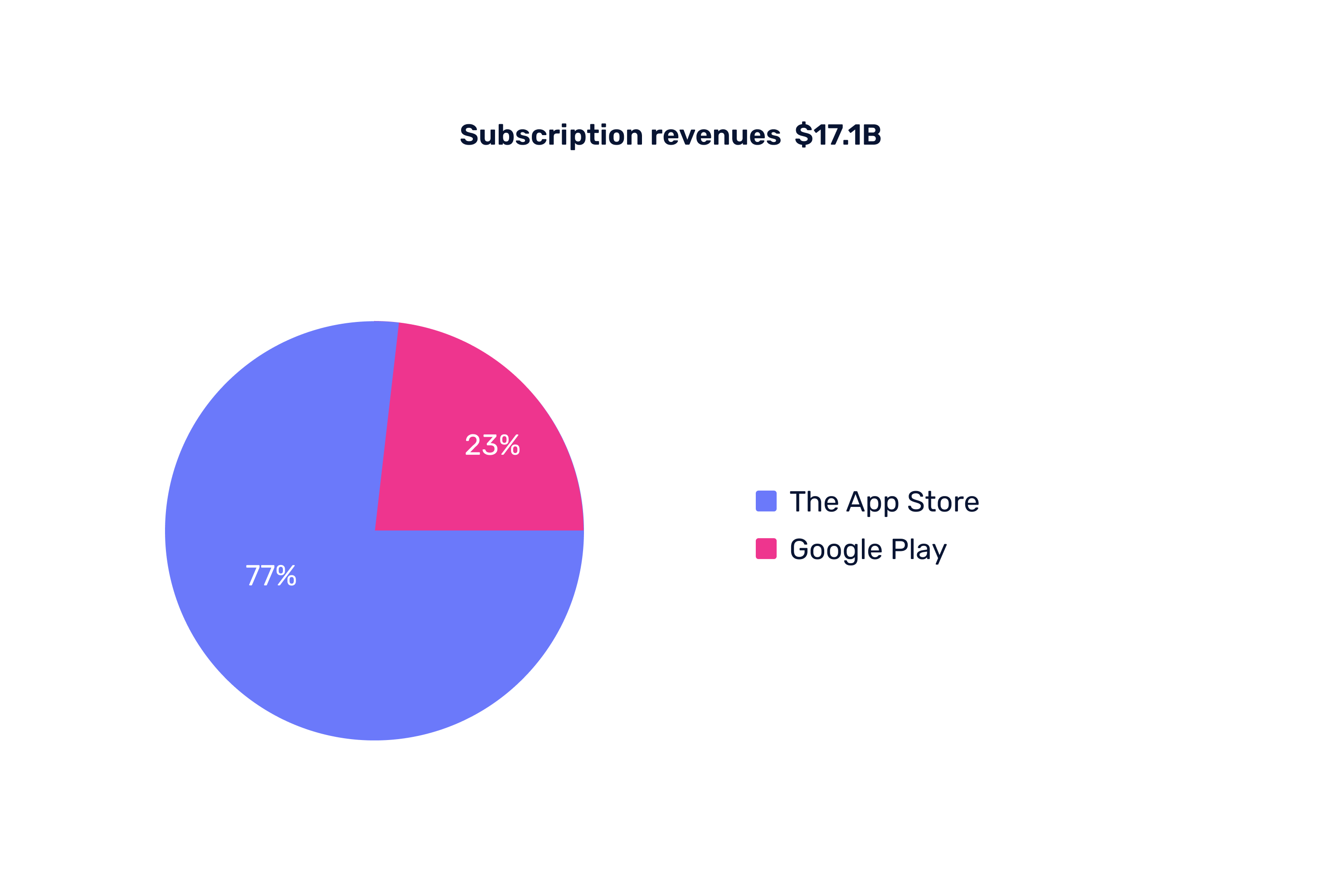
One of the main differences between the stores. Although paid apps on the platforms are 3% on Google Play and 5.5% on the App Store, it doesn't mean that these apps accumulate all the revenue. The remaining apps use internal monetization: in-app advertising, purchases, subscriptions, etc. And it is this kind of monetization that accounts for 48.2% of in-store spending. There is one important "but": the average price of in-app purchases in the App Store is twice as much as Google Play ($12.77 and $6.19). Also, the profit from subscriptions for 2022 was $17.1 billion, and iOS accounted for 77% of that amount.
We can safely say that iOS users are willing to pay more than Google Play users.
Icons
An essential part of a user's first impressions. The icon and title is the first thing a potential new user will see. That's why this element needs to be top-notch.
App Store initially standardized all icons under the same technical parameters, particularly the shape. Google Play, on the other hand, first offered a variety of forms for the developer, but by 2023 came to the rival’s model.
Although the shape of the icons became the same, comparing them in the two stores, you will notice that they are different. Because, more often than not, there are better solutions than icons from one platform for another. And this is one of the questions that take time to be answered. This is why we are writing this article; some things work in the App Store but not in Google Play and vice versa. Other visual elements on the app page also track this behavior.
Screenshots
We've already mentioned the size difference on the page. In this section, the same rule applies; each platform has its guidelines and requirements for screenshot design. The difference is that the App Store effortlessly unifies technical requirements for Apple devices, while Google Play has no such requirements. What's the problem? Standardization: Apple has its product branch, which is constant in its various dimensions. Conversely, Google cannot standardize since Android is the operating system for many different phones. Fitting everything to a few means that some phones will look differently designed.
The statistics also hint that the first screenshot is the most critical. That's why it needs special attention.
Video
Here, the difference is already more noticeable. Let's start with the duration of the App Store, which gives the developer 15-30 seconds and 30-120 seconds the developer gets from Google Play. The time to preview a video is the same as 30 seconds. That said, Google Play users are more likely to view previews than App Store users.
A good solution is not to make the video longer and make it shorter. After all, even "explorers" spend about 35 seconds on the page.
What do we have in general?
User behavior is different on the App Store and Google Play. If a screenshot, icon, video, or whatever worked in one store, don't mindlessly copy and paste it into the other. Remember, A/B testing is the best way to understand what works and where.
Remember that users on each platform have unique behaviors. This means that each store requires a different approach. In our case, the ideal solution is a separate ASO for Google Play and App Store.
Visual interaction is more effective in keeping the user interested. While doing so, we must remember that we are likely to have one chance; the most viewed screenshot is the first; videos are more likely to have a 5-6 second average view time. We must use, show, prescribe, etc., all the best initially; otherwise, it won't even be looked at. Sometimes, no video is better than a wrong video. But if you want to take a risk, our help article will help you make a quality video.
Reviews and ratings should be our complaint book that helps improve the app. And if we did good work during development, a good rating will take care of itself.