An ASO case for a fitness app in the Health & Fitness category is one where the cost of getting it wrong is higher than in most other niches. The subscription model doesn't forgive mistakes: if a user arrives from the wrong query, they won't convert — and they won't come back.
Below is a full work cycle for an app: from audit to the first data after publishing. The app is a modeled example; the process and data are real. All metrics are from ASOMobile.
The Competitive Challenge in the Fitness App Category
The fitness app market is structured in a way that puts a new product at a disadvantage from the very start. Strava has been around since 2009, Nike Run Club has hundreds of millions of downloads, and Runkeeper has a decade of accumulated position history — all of which directly affects how the App Store algorithm prioritizes results.
The algorithm weighs historical signals: install velocity, user retention, review volume, keyword position history. An app that has been building these signals for years will rank above a new one on the same query — not because it's better, but because the algorithm knows it well. That's a structural advantage that solid metadata alone can't overcome.
Which is why competing directly on broad queries — running app, fitness tracker — doesn't make sense at the start. The task was to find entry points where that advantage works less strongly.
The app in this case study is a running and walking tracker with GPS, routes organized by difficulty level, built-in warm-up and stretching routines, and the ability to share results. Monetization: subscription with a free basic tier. At launch: no recognizable brand, no position history, no accumulated installs.
Initial ASO Audit and Key Growth Bottlenecks
Before touching metadata or visuals, the first step was understanding what the starting point actually looked like. The audit covered three areas: keyword coverage, search visibility, and the app page itself.
The keyword picture was straightforward: very few indexed relevant queries. Without indexation, there's no organic traffic; without traffic, there are no behavioral signals; and without signals, the algorithm has nothing to work with. A low Visibility Score confirmed it — the app simply wasn't appearing for the queries its potential users were typing.
The app page carried a different kind of risk: conversion. Even if rankings started to improve, a page that doesn't communicate value quickly would just waste that traffic. Screenshots showing an interface instead of use cases, an icon that disappears in a crowded results list, a description that reads like a spec sheet — any one of these could cancel out the results of all the keyword work.
The audit produced a clear order of priorities: keywords first, then metadata, then visuals, then monitoring and the next iteration.
Keyword Strategy and Competitor Analysis
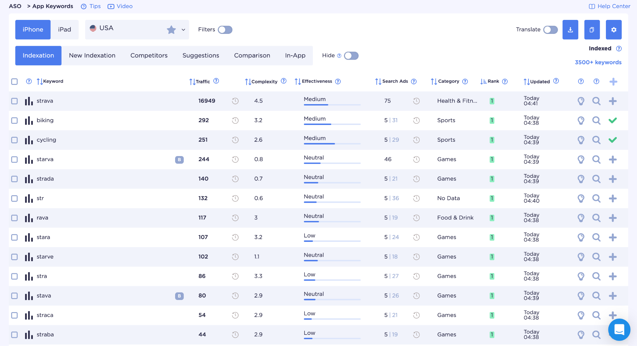
The starting point was a competitor with a high indexation rate. Strava has 3,500+ indexed queries — a solid base for understanding which keywords actually work in this niche.
Competitor analysis in ASO isn't about copying what the leaders do. It's about finding where they're weak. Some of those thousands of Strava queries represent positions built deliberately over years. Others are incidental — the app ranks there because the algorithm recognizes its authority in the category, not because the keyword was ever a priority. Those incidental positions are the entry points for a new app.
The keyword set was built around functional groups, based on what the app actually does differently from other trackers.
Core queries — mid-frequency keywords with clear intent: run tracker, gps running app, outdoor running app. A necessary foundation, but not the only entry point — competition here is higher than in the niche groups.
Routes — the main differentiator and an area where the big players are noticeably weaker: running routes, route planner running, trail running app. Most of Strava's authority is concentrated around general running queries, not route planning specifically — this is where a new app had a real shot at ranking faster.
Workouts and warm-up — a feature most trackers don't have: warm-up exercises, pre-run warm-up, post-run stretching. Competition on these queries is lower, and the intent is specific. A user typing pre run warm up knows exactly what they're looking for.
Social layer — share workouts, a social fitness app, and a running community. A different intent profile compared to pure GPS tracking queries, and typically a different audience.
Long-tail queries — running app with routes, free running tracker with GPS, jogging tracker with route planner. Less traffic, higher conversion: the user is describing a specific product, and if it exists, the install is almost guaranteed.
For each group, the results were checked to see who actually holds the top positions and how dominant they are. Strava or Nike Run Club appearing in the top results isn't a reason to abandon a query — it's confirmation that an audience with that intent exists. A scattered results page without clear leaders is a signal that gaining traction there will be faster.
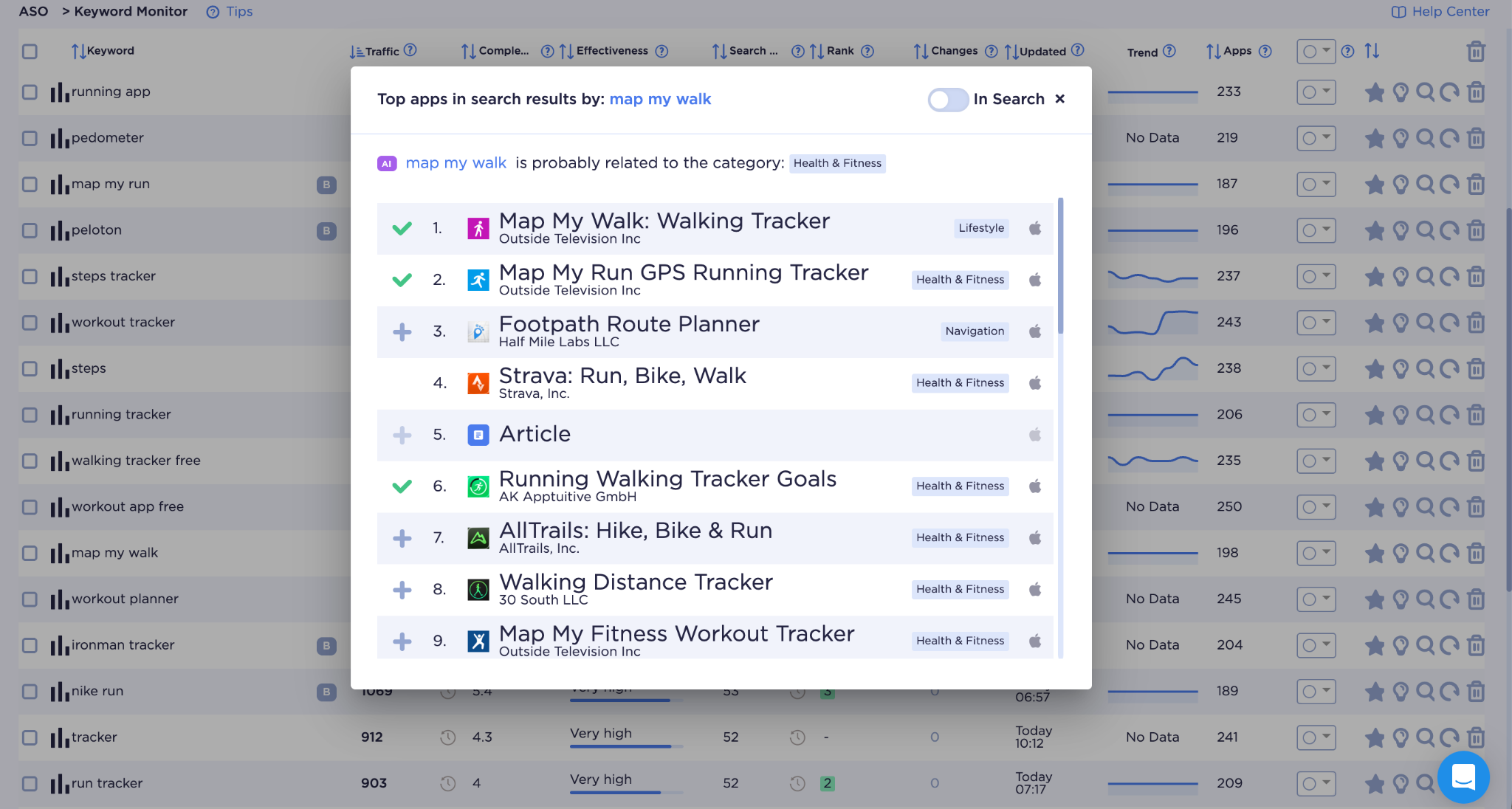
After checking relevance and removing queries with no realistic path to ranking, the final set was 141 queries across 7 groups.
Metadata, Creative, and Conversion Improvements
With the keyword set ready, the next step was translating it into metadata and visuals that would both rank and convert.
For metadata, ASO Creator was used with AI generation: the app's features, target audience, and brand name went in, and the first draft of the title, subtitle, and description came out with keywords already distributed. First version results: 122 out of 141 keywords covered. Traffic coverage — 21,364 out of a possible 58,437. Both are starting points for iteration, not finish lines.
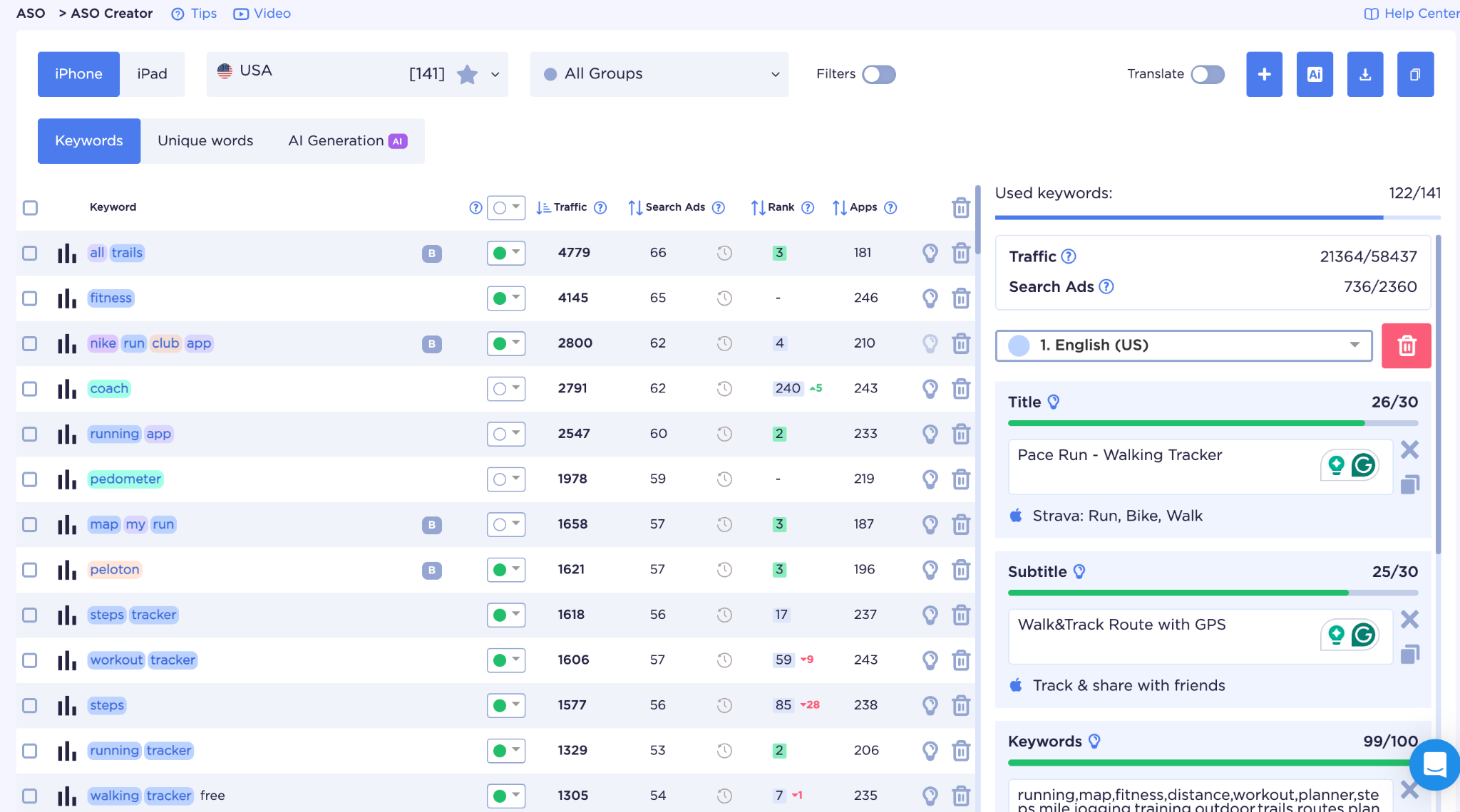
The title covered several queries from the core group. The subtitle picked up the social layer and verb-forward phrases from long-tail searches. Every word in those 30 subtitle characters has a specific job — there are no accidental choices. Additional locales absorbed the remaining keyword set for markets without dedicated ASO strategies.
Visual competitor analysis isn't about inspiration — it's about understanding which colors and images are already claimed in users' perception. In running trackers, orange is associated with Strava and black with Nike Run Club. Showing up in orange next to Strava means working for their brand recognition, not your own.
Blue and green turned out to be the logical choice: blue reads as precision and tech, green as outdoor environment and routes. Both colors match what the app actually does, and neither overlaps with what's already firmly taken in the category.
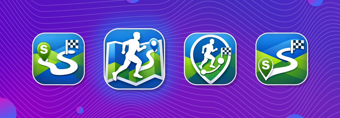
Of the four icon options, the strongest was a runner on an unfolded map — it reads simultaneously as running and route planning, which is exactly the main differentiator. The GPS pin option loses legibility at small sizes; a silhouette without a map loses the route emphasis entirely.
Screenshots were built around one principle: each one answers a single question a skeptical user is asking before deciding to install.
- First: what will I get?
- Second: how does it work in practice?
- Third and fourth: is there anything beyond tracking?
- Fifth: will I come back?
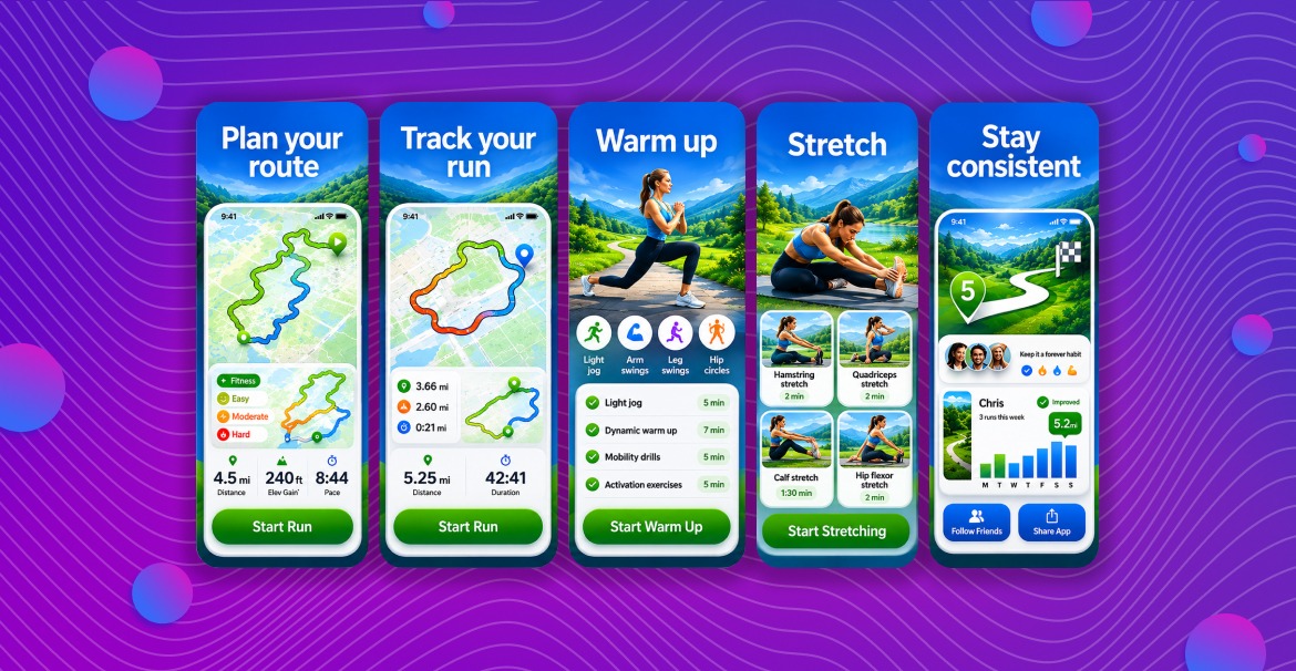
None of the screenshots show a static interface. Each one shows a moment of use — that's the distinction that matters for conversion.
Ratings, Reviews, and Ongoing Monitoring
Keyword rankings determine whether users find the app. Ratings and reviews determine whether they trust it enough to install — and whether the algorithm treats it as a product worth surfacing.
For a new app, the main challenge with ratings is timing. Most users who have a good experience don't leave a review unprompted. A review request shown immediately after install rarely works — the user hasn't experienced anything yet. A request shown after a completed run or after the third session reaches them at a time when the app has already delivered value. That timing difference consistently produces higher response rates and better average scores.
With negative reviews, response speed and specificity matter. A generic response signals that no one is paying attention. A specific response that acknowledges the issue and describes what's being done about it serves two audiences: the user who left the review, and every future user reading it before deciding to install.
Monitoring tracked rating trends by app version, review volume, and sentiment across markets. A rating drop after an update is a signal — catching it within 48 hours rather than two weeks makes the difference between a contained issue and a sustained decline that affects rankings.
On the keyword side, post-iteration monitoring checked which groups gained, which dropped, and whether the drops were worth addressing. Not every ranking loss is a problem. The monitoring cadence was two-week intervals for the first three months, then monthly once position distribution stabilized.
Results, Lessons, and Next Steps
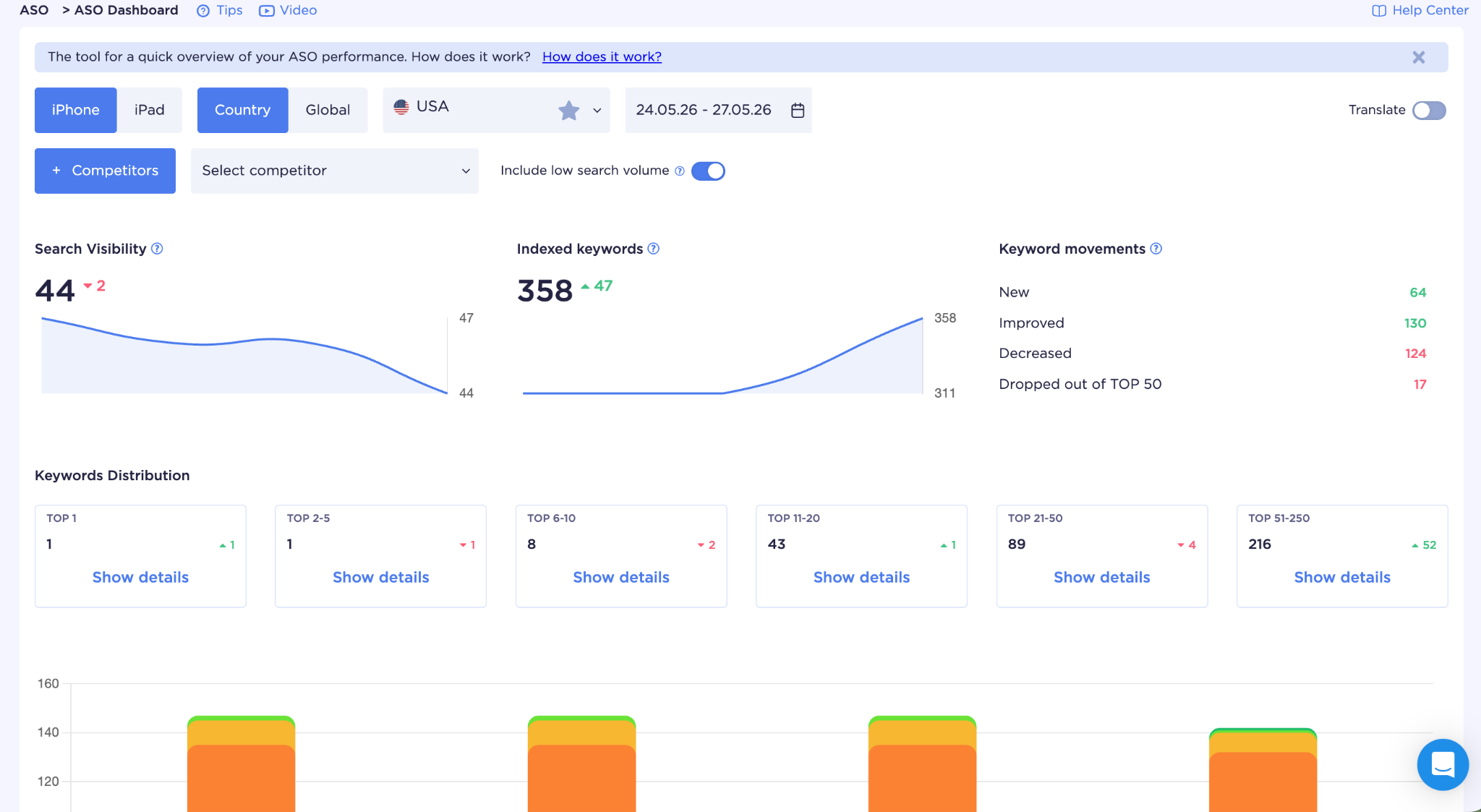
Data one week after the first iteration:
| Metric | Before optimization | After first iteration |
| Indexed queries | ~248 | 358 |
| New keywords in search results | — | 118 |
| Keywords that improved in ranking | — | 106 |
| Keywords in top 11–20 | 0 | 43 |
| Keyword set coverage | — | 122 of 141 |
118 new keywords represent queries where the app had no presence before the iteration. That's the clearest signal from a first pass: the algorithm has started indexing the app for queries it previously ignored.
106 keywords improved their positions. 89 dropped. 8 fell out of the top 50. This is a normal distribution for a first iteration — some of the previous positioning was incidental, and the metadata changes shifted the algorithm's understanding of what the app is most relevant for. The drops are data, not failure.
Visibility Score reached 44. For a new app that's expected — what matters is the trend over the next two weeks.
One result that confirmed the original hypothesis: queries from the routes and warm-up groups climbed faster than the core running queries. Entering through functional niches worked better than competing directly on broad terms, which is exactly what the strategy anticipated.
The lessons from the first iteration shaped the second. The groups that moved fastest were expanded. Those with minimal movement were reviewed — some deprioritized, some repositioned differently in the metadata. The screenshot sequence was tested against an alternative version to measure the effect on conversion.
| Stage | Action | Expected effect | KPI |
| Audit and keywords | Building the keyword set from competitor analysis, grouping 141 queries | Understanding the niche and entry points | Keyword coverage, competitor analysis |
| Metadata | Title, subtitle, description with 122/141 coverage | Indexation growth, new keywords in search | Number of indexed queries |
| Visuals | Icon, 5 screenshots by use case | Higher conversion from view to install | Page CR, A/B test |
| Ratings and reviews | Review prompt timing, response workflow, sentiment monitoring | Higher average rating, trust signals for the algorithm | Average rating, review volume, response rate |
| Monitoring | Position analysis every 2 weeks, group-level review | Targeted adjustments based on real movement data | Position changes across groups, Visibility Score trend |
Conclusion
The Health & Fitness category doesn't get easier with time. More apps launch every month, the leaders keep accumulating behavioral signals, and the algorithm keeps rewarding history. A new app that tries to compete on broad terms from day one is fighting the wrong battle.
What works is a structured approach: study the competitive landscape through data, build a keyword set around functional niches where the leaders are weaker, translate that into metadata with the right coverage, build a page that converts the traffic you earn, manage ratings as a trust signal, and monitor closely enough to know what's working before the next iteration.
Every step generates data that makes the next one more accurate. The first iteration is never the final answer — it's the first real signal about how the algorithm reads the app and where the actual opportunities are.
ASOMobile covers the full workflow: keyword research and competitor analysis, metadata building with coverage tracking, and position monitoring after every update. For fitness app teams working iteratively, having all of that in one place makes the feedback loop significantly tighter.
For a broader look at the fitness app category — competitive structure, market trends, what to expect before you start — read our article on ASO in the Health & Fitness category.
Optimize easily and budget-friendly 💙
FAQ: Frequently Asked Questions
The category is dominated by apps with years of position history and millions of installs. The algorithm weighs these signals heavily, so a new app targeting broad queries is competing against products it already knows well. The way in is through niche query groups, where the accumulated advantage of established players is less pronounced.
Start with what the app does differently, not with search volume. Identify which functional groups the product covers, then check the results for each one — how dominant are the players there. High-volume queries with strong competitors in the top positions are low priority for a new app. Specific intent with weaker competition is where ranking growth actually happens faster.
The starting situation with specific metrics — indexed queries, Visibility Score, conversion rate. A description of each step with the reasoning behind the decisions, not just a list of actions. Before-and-after data from the first iteration. And an honest assessment of what moved, what didn’t, and what the next iteration is targeting. A case study without numbers is just a list of things someone did.
Competitor keyword sets show what’s already working in the niche. More importantly, they show where established apps are weak — queries they rank for incidentally rather than through deliberate optimization. Those gaps are the entry points. Visual competitor analysis shows the category conventions, which informs both differentiation decisions and baseline quality standards.
Number of indexed queries and its week-over-week trend, position distribution across query groups, Visibility Score trajectory, app page conversion rate, average rating, and review volume. None of these tells the full story alone — indexed queries only matter if positions are improving, positions only matter if the page converts, ratings only matter if the volume is statistically meaningful. They work as a system.